orla-kelly.com

Design and build a website to showcase my sister's artwork.

UX & UI design, creative concept, Webflow development
Visit website
Orla needed a website to showcase her artwork for potential collaborations with other artists, curators, and cultural institutions that she is interested in working with.
Row of tablets and smartphones displaying Orla Kelly's colourful artwork and website layouts.

Look and feel

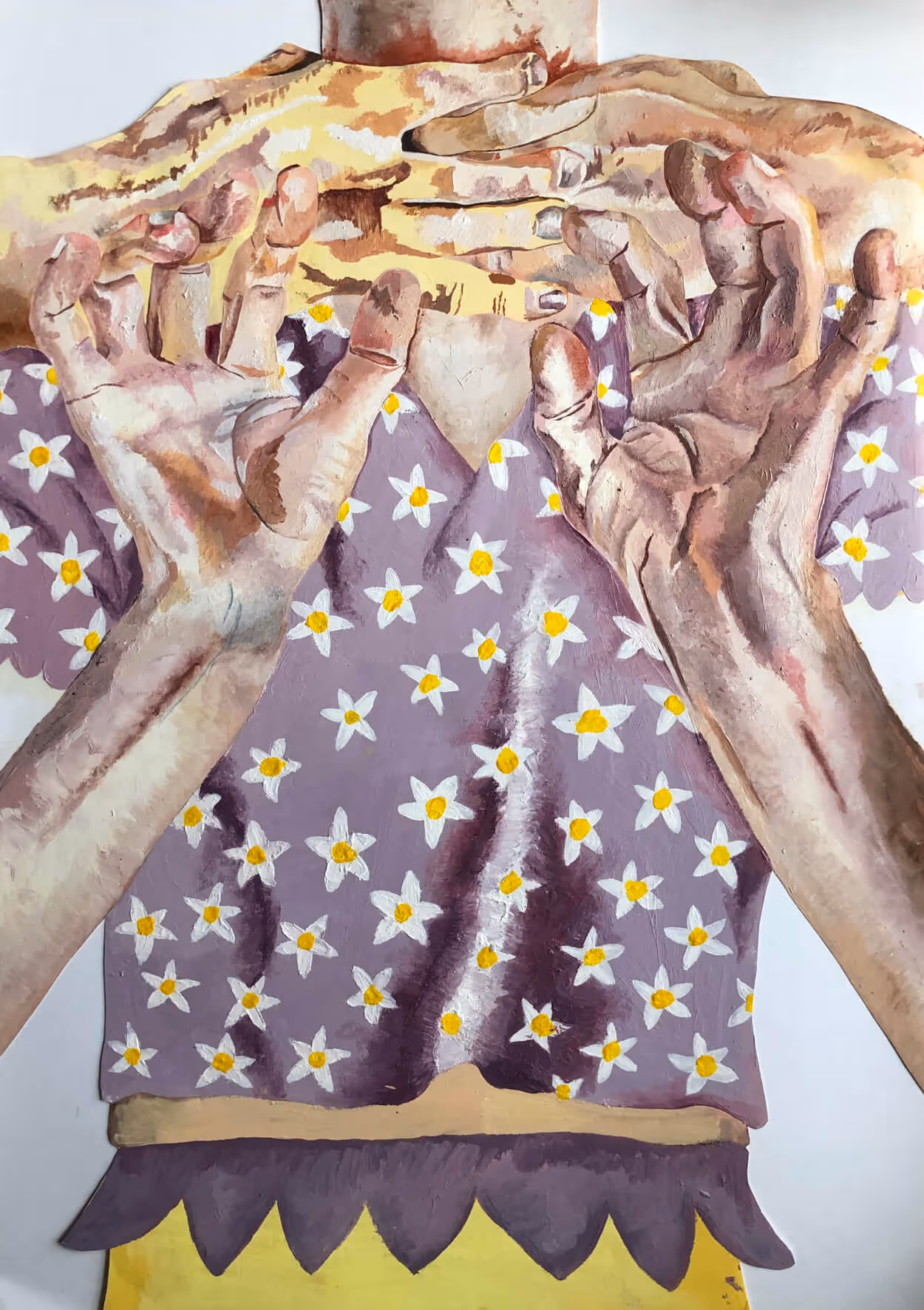
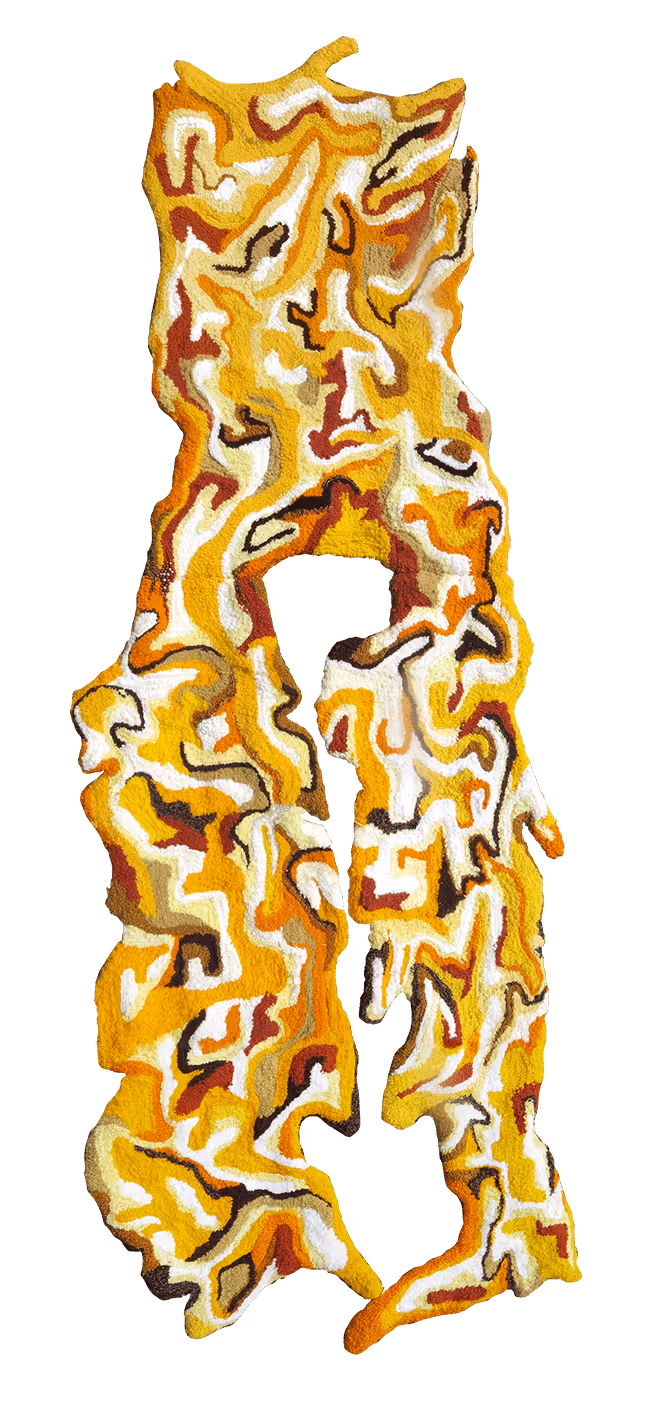
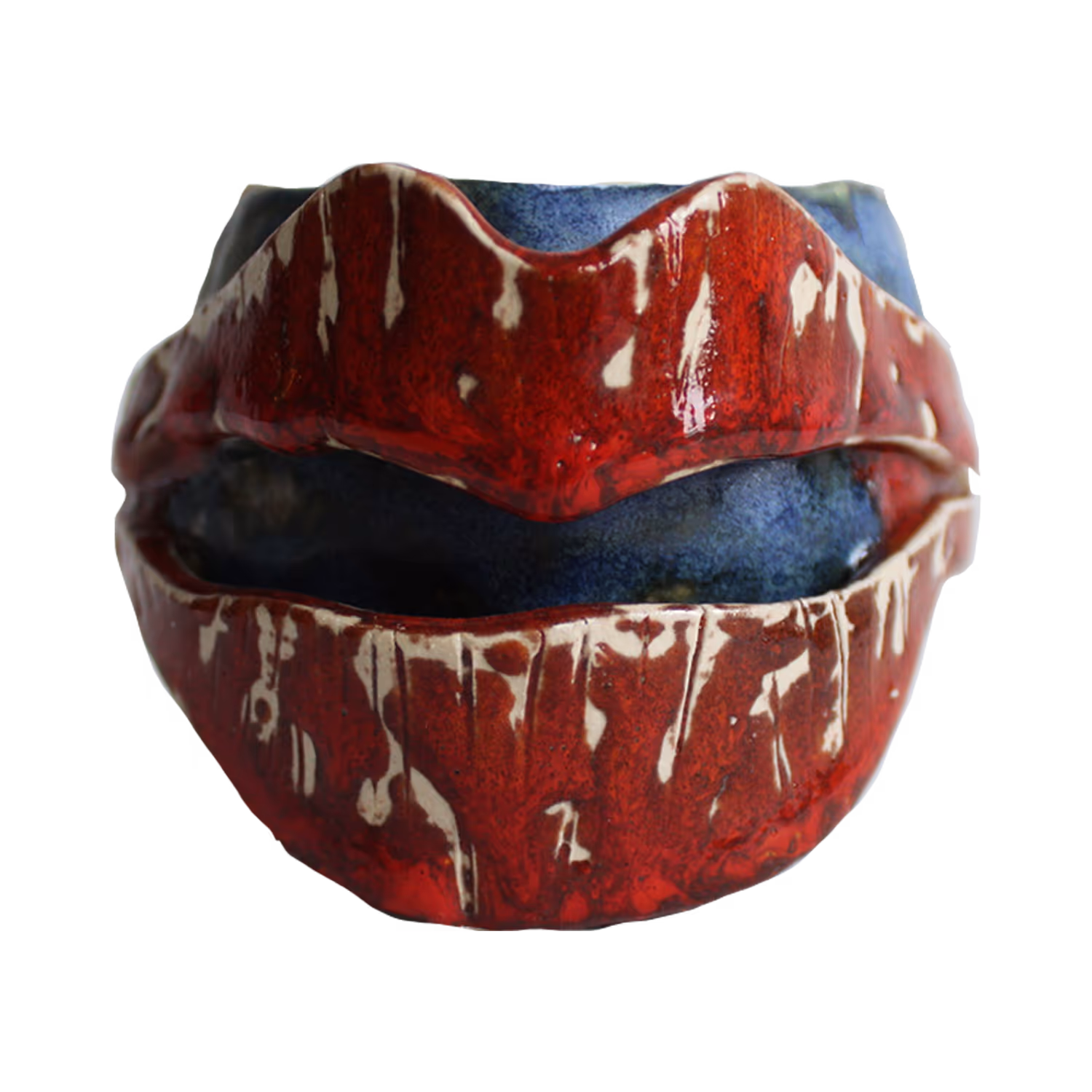
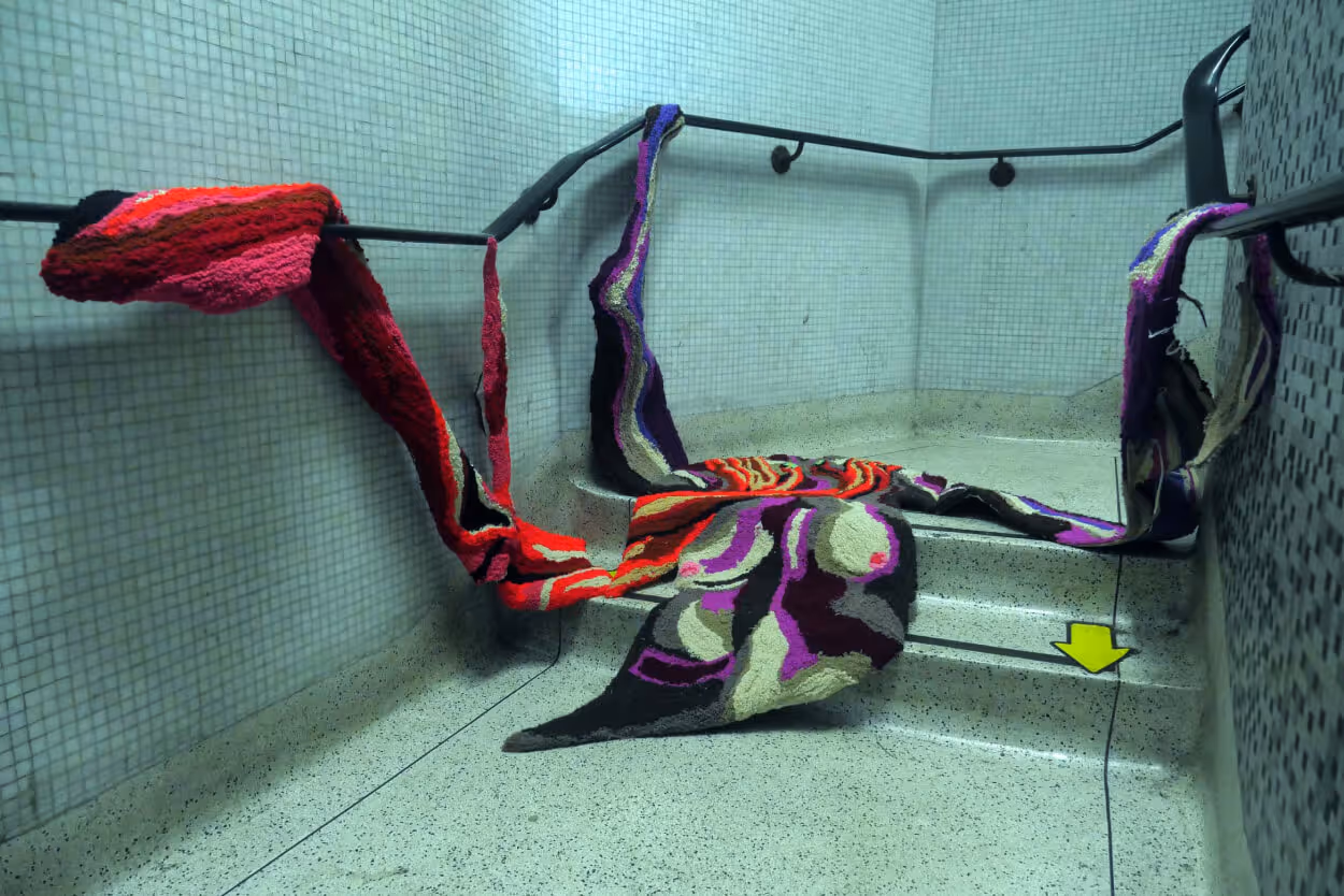
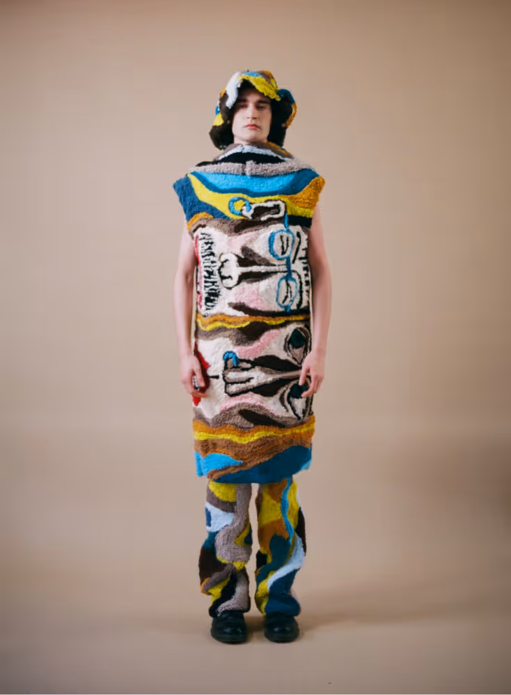
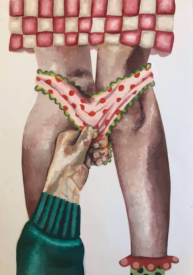
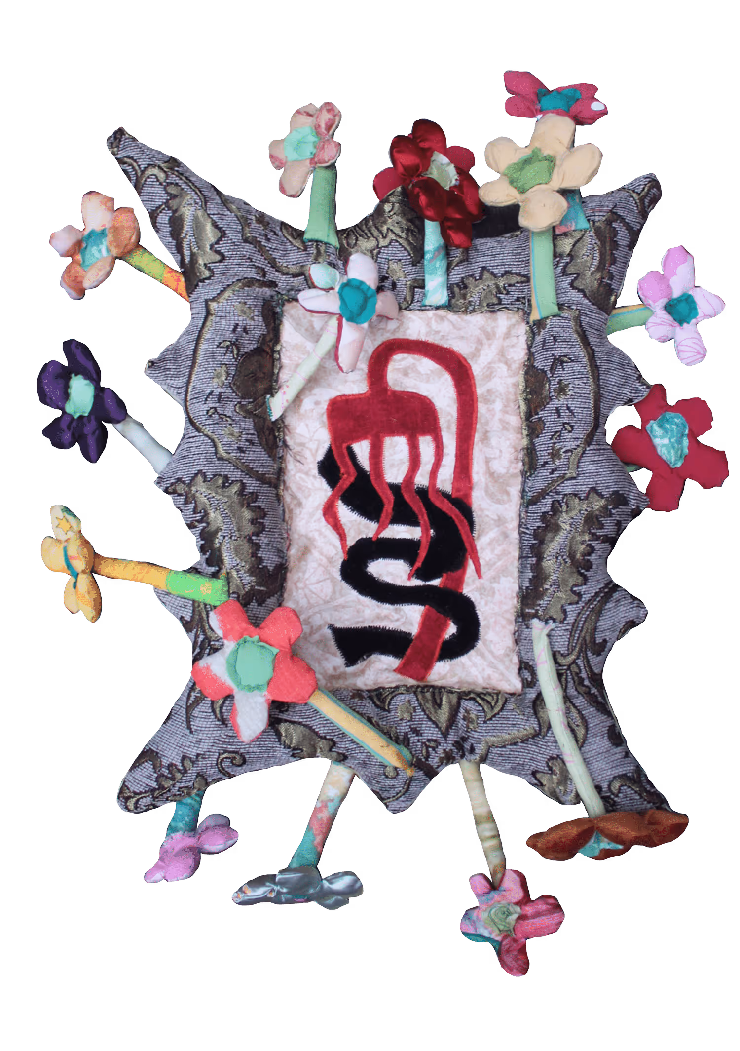
We wanted the site to reflect the energy of Orla’s work and aesthetic. Since the primary content of the site is imagery of her work, that energy was already taken care of. I felt my job, rather than matching that energy, was to create a space for it to speak for itself without interrupting it.

1.
Oil painting of dirty j cloth on corner of table.
“Mam’s Dirty J-Cloth”, 2022. Oil paint on canvas.
2.
Painting of a green hand gripping a red arm against a blue background.
“Arm Pull 2”, 2021. Oil pastel on paper.
3.
Painting composed of overlapping arms and hands rendered in fleshy tones.
“Flowers”, 2020. Oil paint on paper.
4.
Golden yellow tufted sculpture with organic shape.
“Eggs”, 2023. Wool on hessian.
5.
Ceramic sculpture. Blue mug with red lips.
“Brother 1”, 2022. Ceramics.
6.
Photo of an installation with brightly coloured woven forms draped over handrails in a tiled hallway.
7.
Model wearing tufted sculpture from "I'll be at yours in 5" series.
8.
Close‑up painting of a hand grasping the hem of woman's under-ware.
9.
Photo of textile artwork from "Breakfast" series.
1.
“Mam’s Dirty J-Cloth”, 2022. Oil paint on canvas.
2.
“Arm Pull 2”, 2021. Oil pastel on paper.
3.
“Flowers”, 2020. Oil paint on paper.
4.
“Eggs”, 2023. Wool on hessian.
5.
“Brother 1”, 2022. Ceramics.
6.
“Push”, 2021. Wool on hessian.
7.
“I’ll be at yours in 5 xxx”, 2022. Wool on hessian.
8.
“Squares and Spots”, 2020. Oil paint on paper.
9.
“Wild Flowers”, 2023.

One of the bigger challenges was creating a sense of tension—something Orla was drawn to in other sites we explored during benchmarking. It's deliberately awkward design, often achieved through unusual layouts, bold type, and unexpected colour choices. I also like the feeling that friction evokes—maybe challenging some ideas of aesthetic that we take for granted—but I wanted to find a way to introduce it without sacrificing usability or functionality. I found a solution we both like in the grid and layout. First let's look at typography and colour.

A series of screenshots of deliberately awkward designs.
Screenshot of sample of deliberately awkward design.

Typography

Nuvo Mono Pro.

Medium, 14/18

Our primary font is Nuvo Mono Pro. It's rounded and friendly, but rigid, which bring a kind of quiet friction to the site which I like.

Futura PT Condensed

Medium, 32/40

Our secondary font is Futura PT Condensed. I like how it brings a bit of structure and weight, balancing the playfulness of Nuvo Mono and the energy of Orla’s work.

Colour

A white background allows Orla's work to breathe. The challenge was bringing in colour that reflected her personality without clashing with the work. Pink speaks her language—so we paired it with a complementary deep green for body text and a very occasional zesty green accent.

Grid and layout

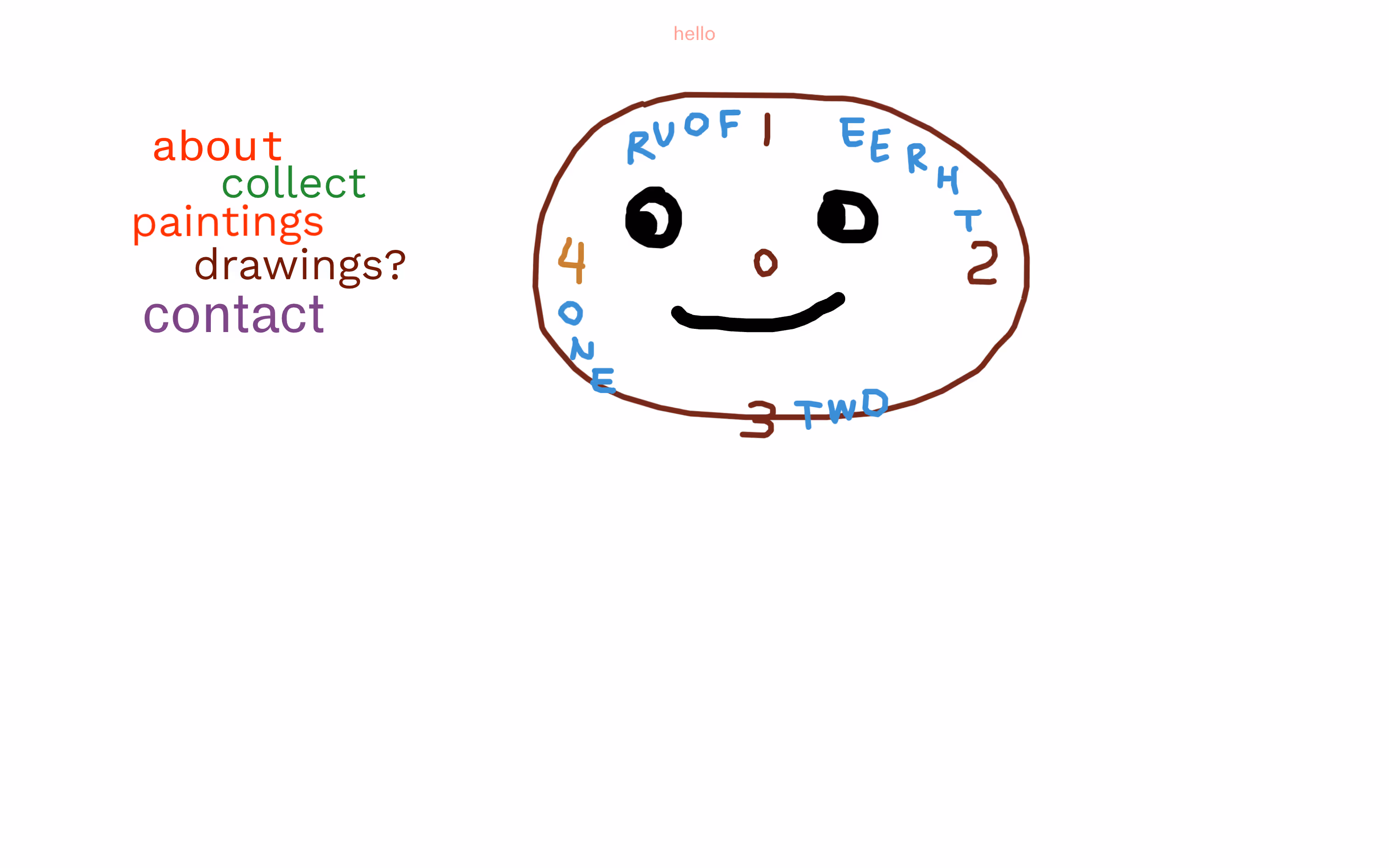
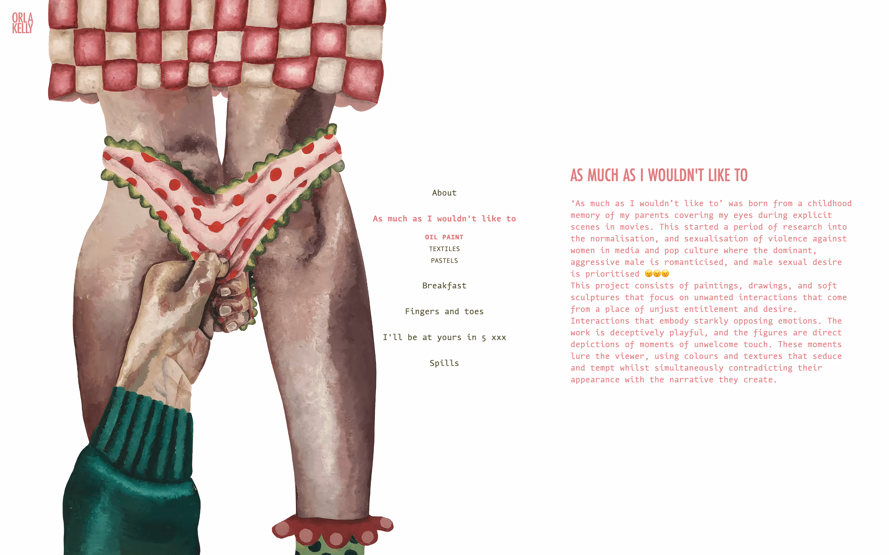
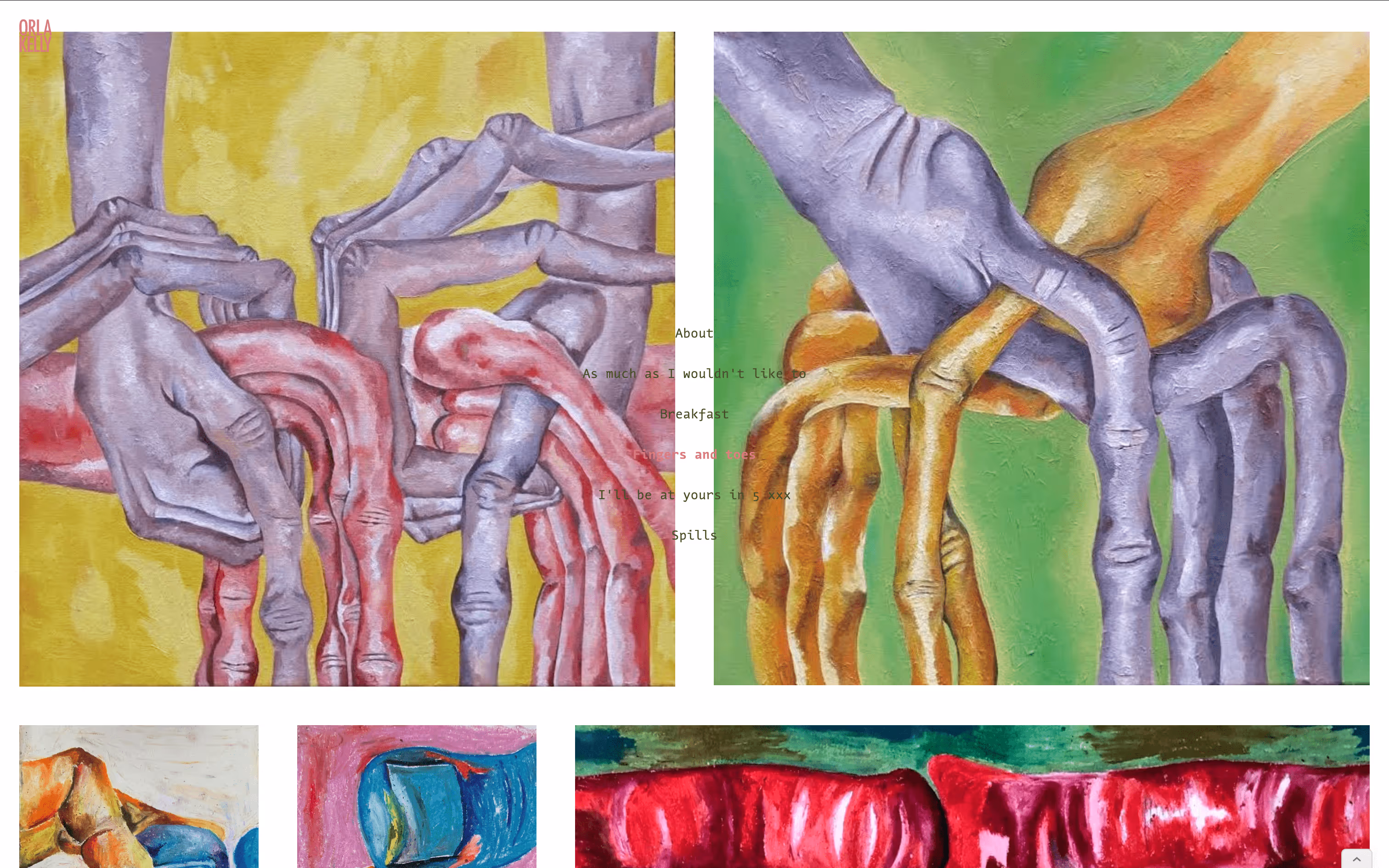
One of my favourite things about this project was putting the navigation right in the centre of every page. I think we get away with it because there’s so little text to organise around it, and the images are strong enough to hold their own. Breaking away from the usual—nav at the top, in a sidebar, or tucked into a burger menu—creates that bit of friction I mentioned earlier. Orla’s work often leaves you feeling slightly unsettled (in the best way), so I love that the site does the same.

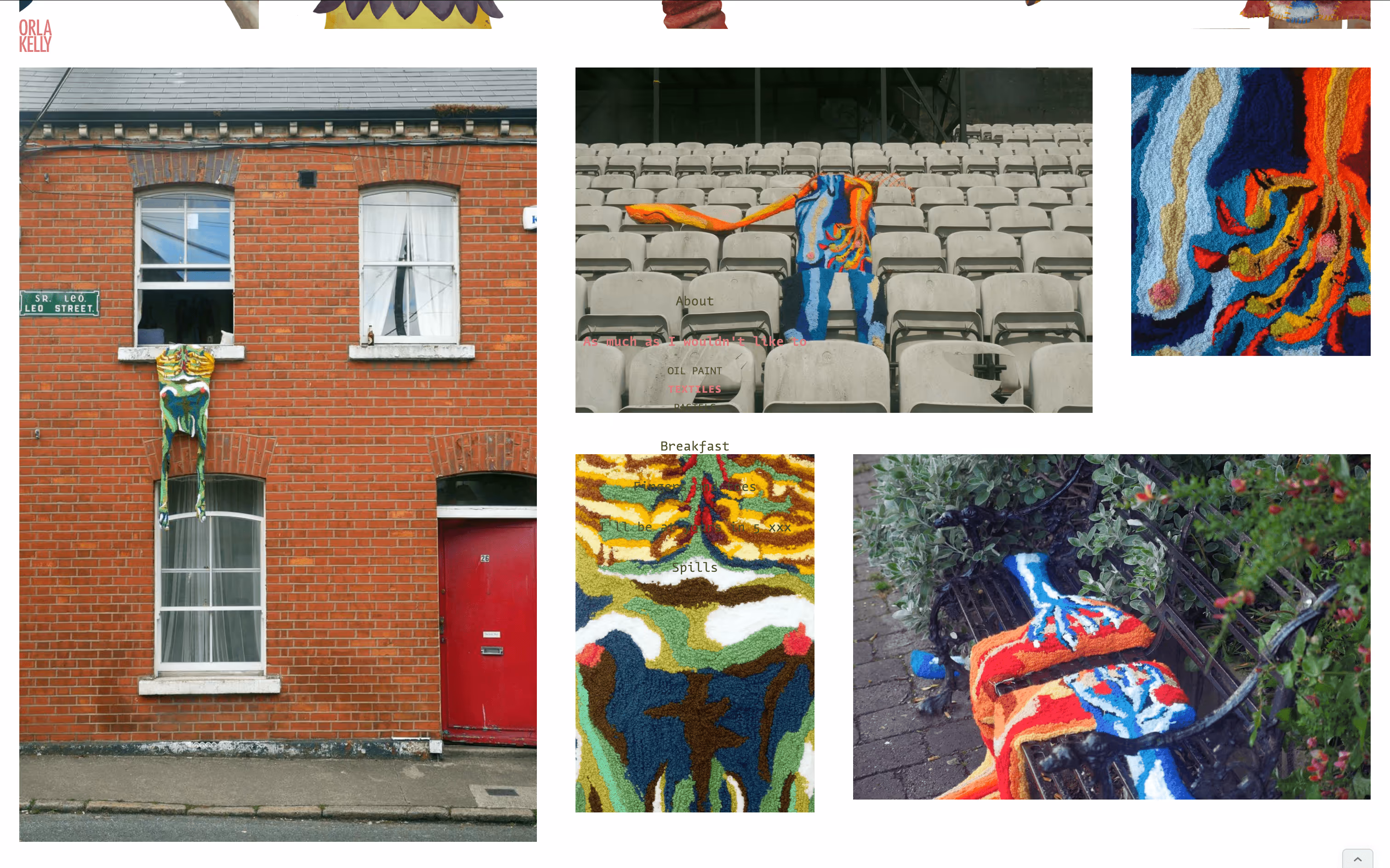
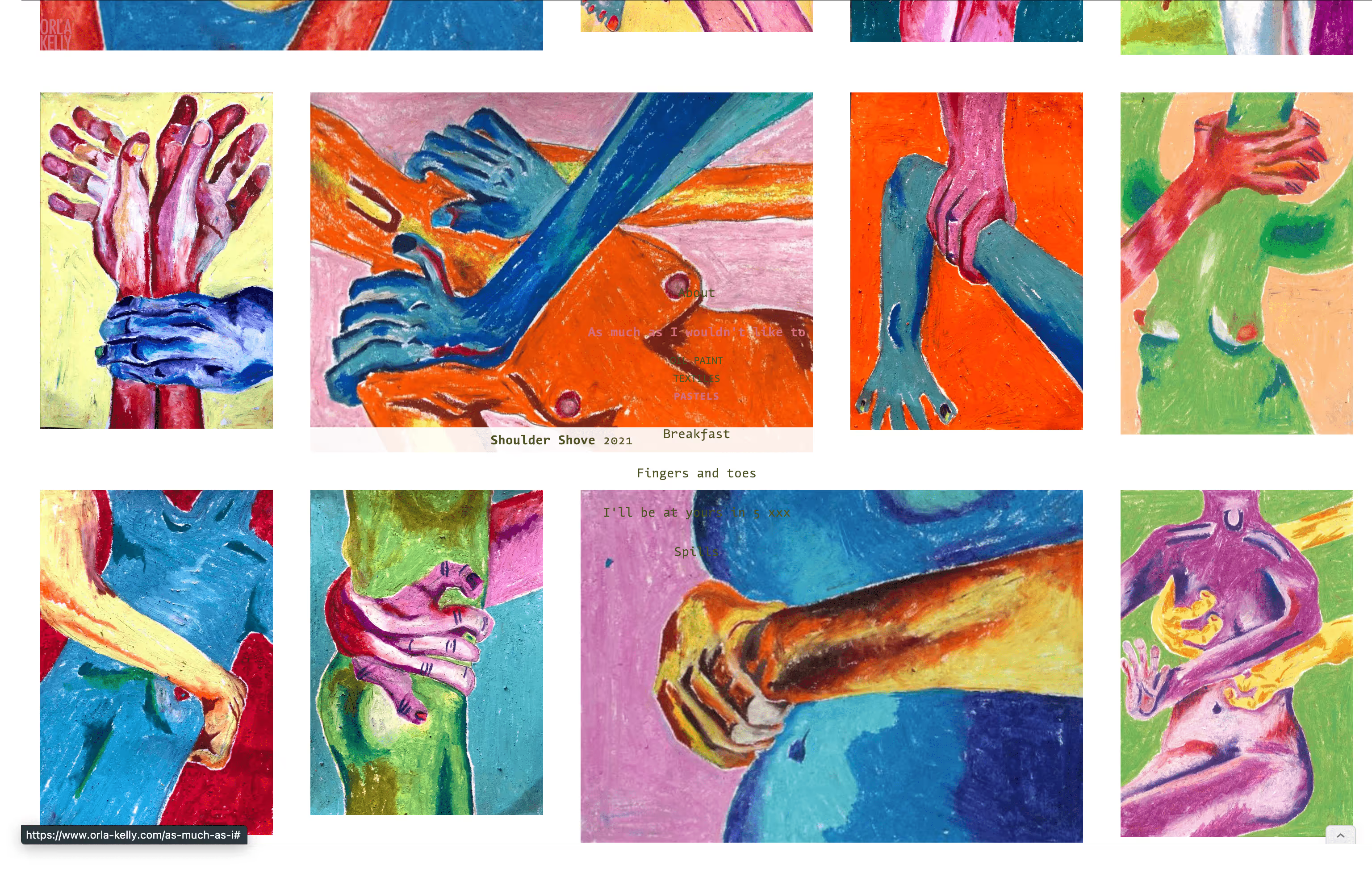
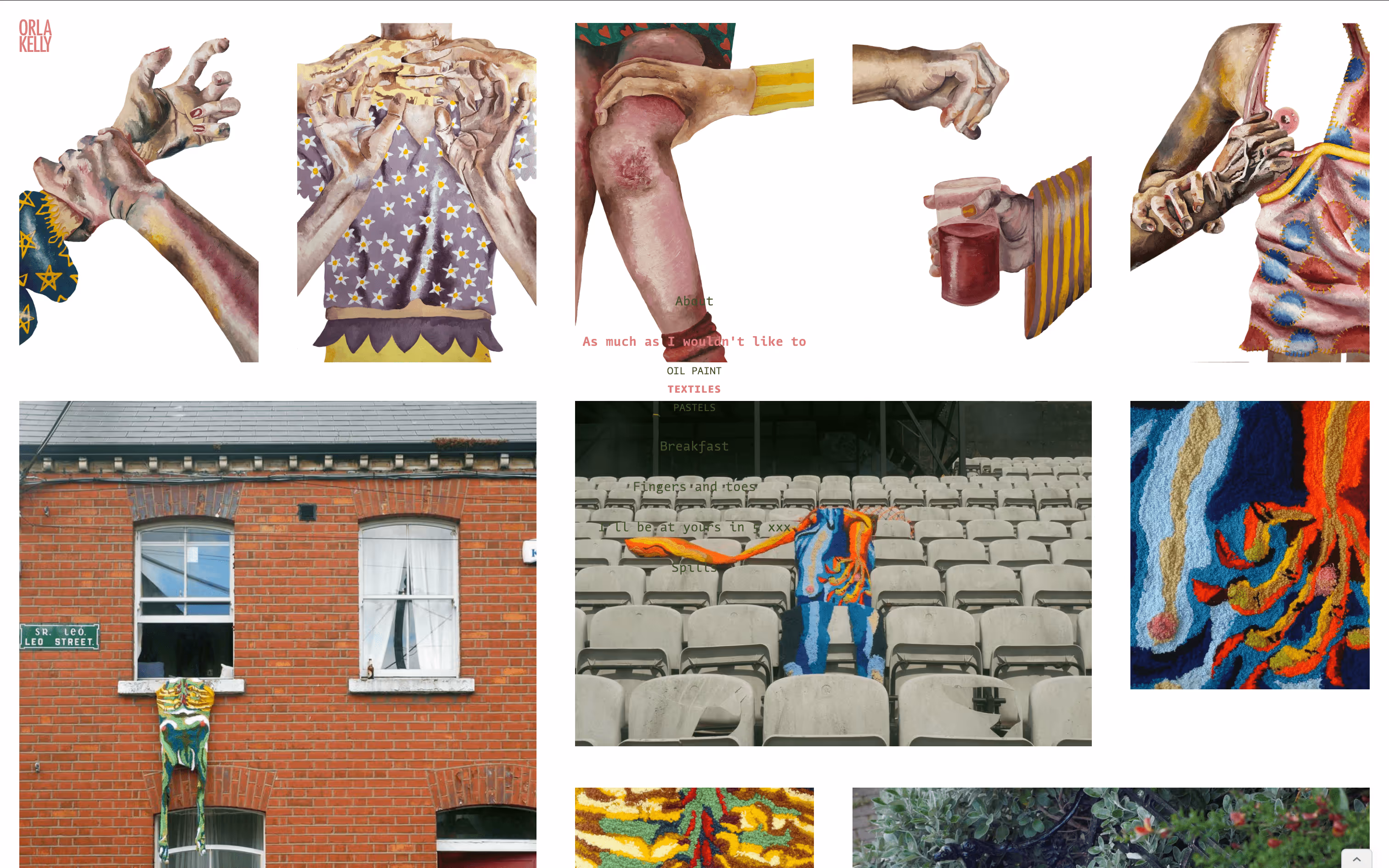
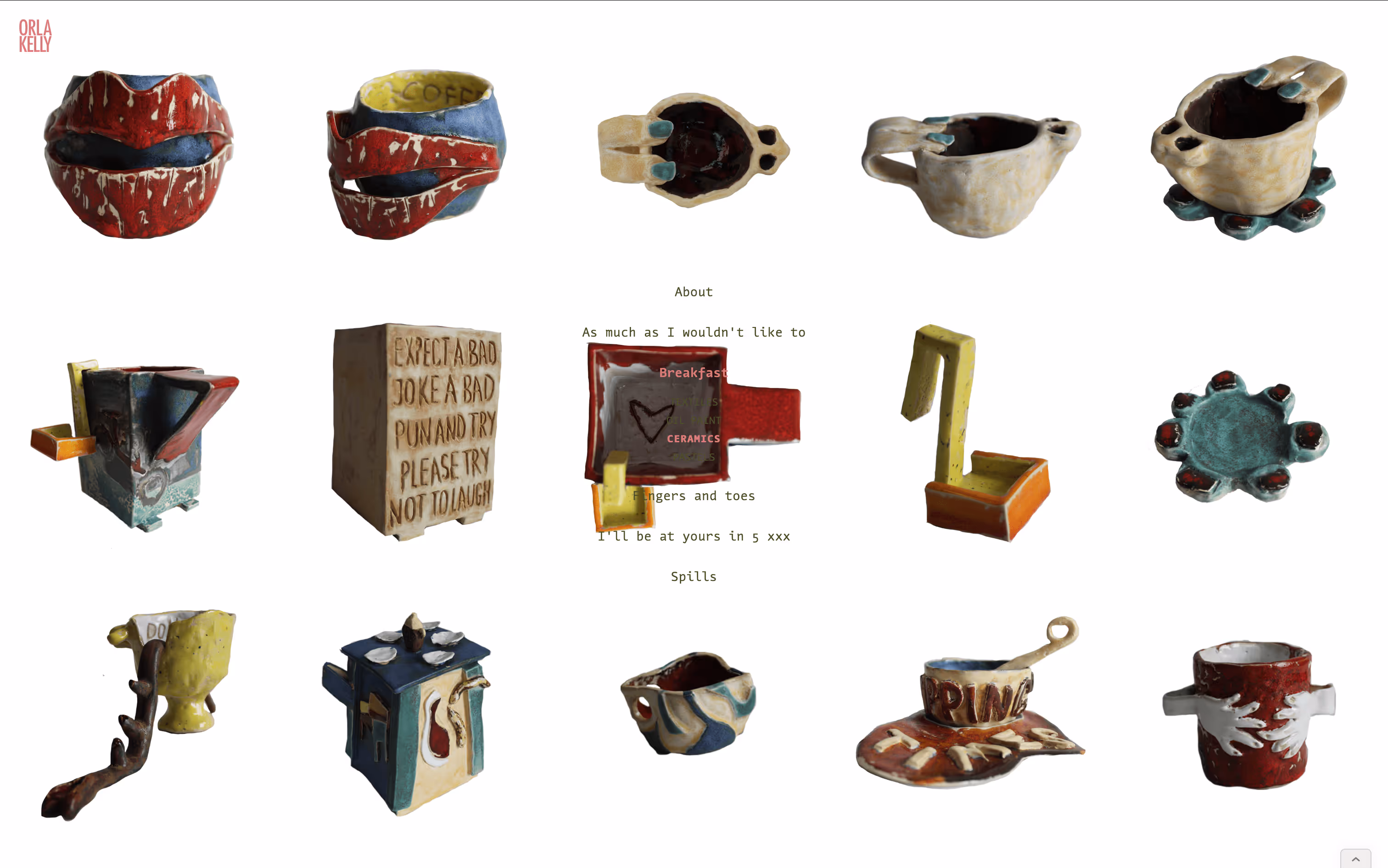
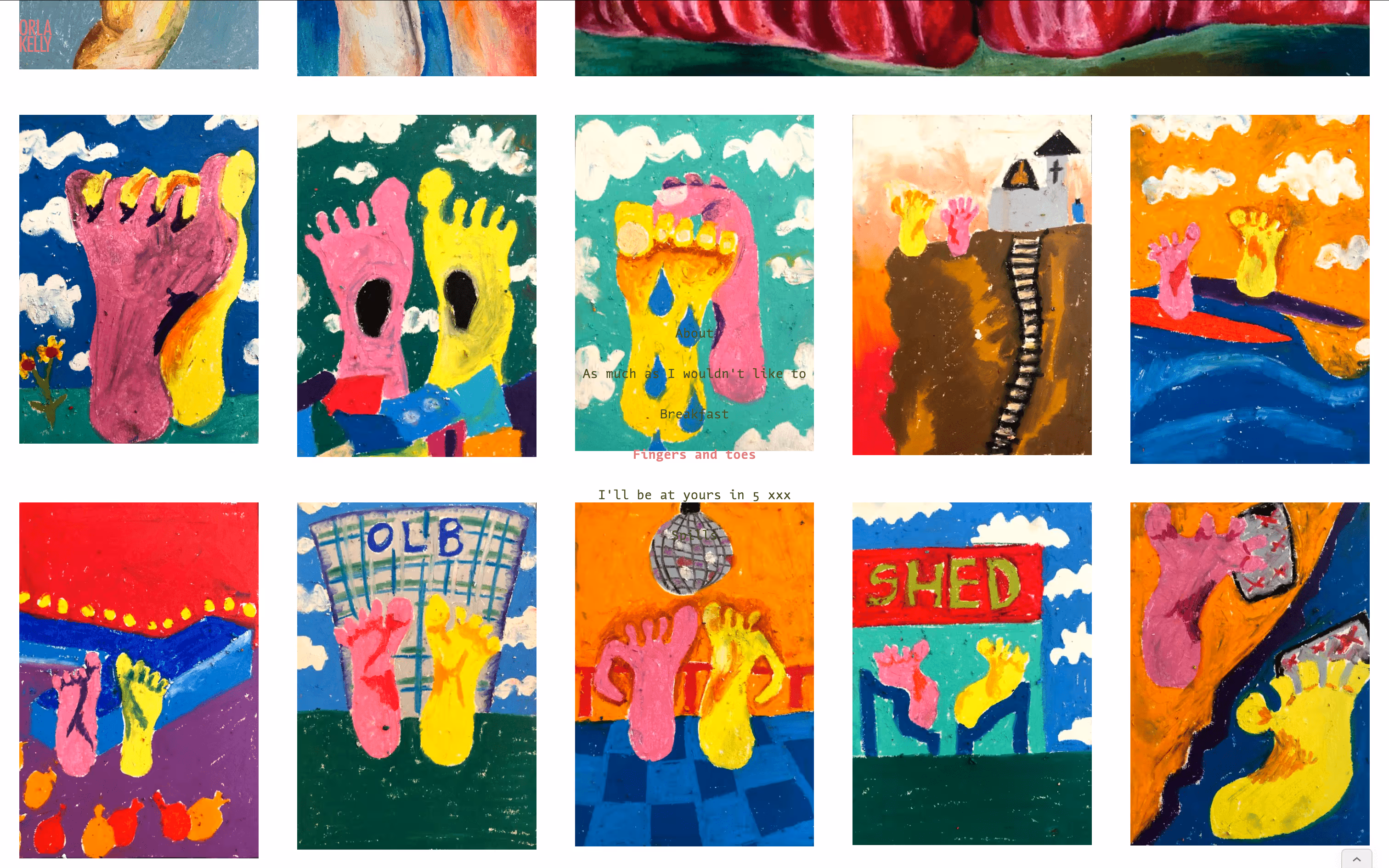
The images sit in a five-column “gallery grid” (20px margins, 40px gutters) with flexible row heights, creating a set of cells I could merge into larger frames. The nav menu stays locked in the middle.

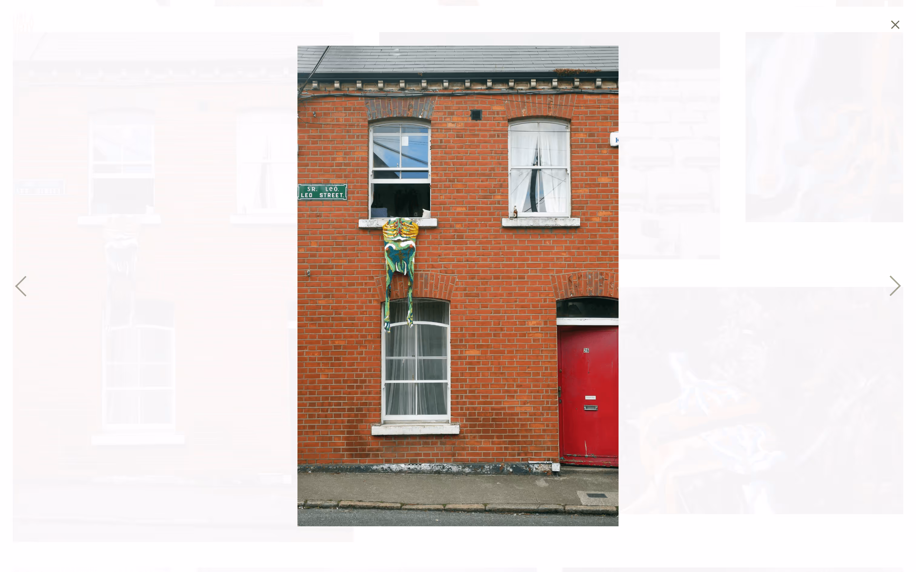
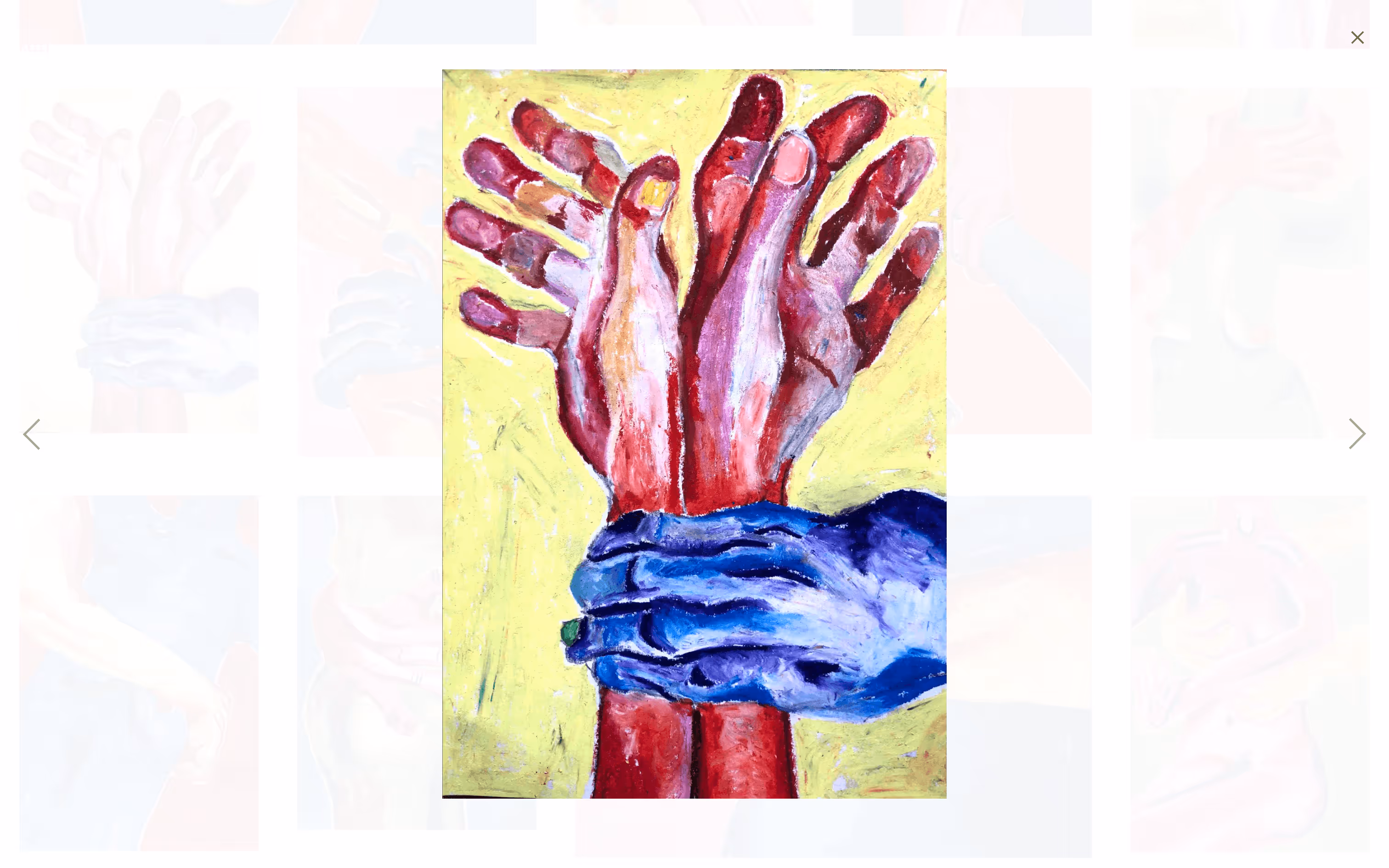
This setup provides loads of flexibility for layouts. Hovering over a work reveals key details, and clicking opens an isolated view.
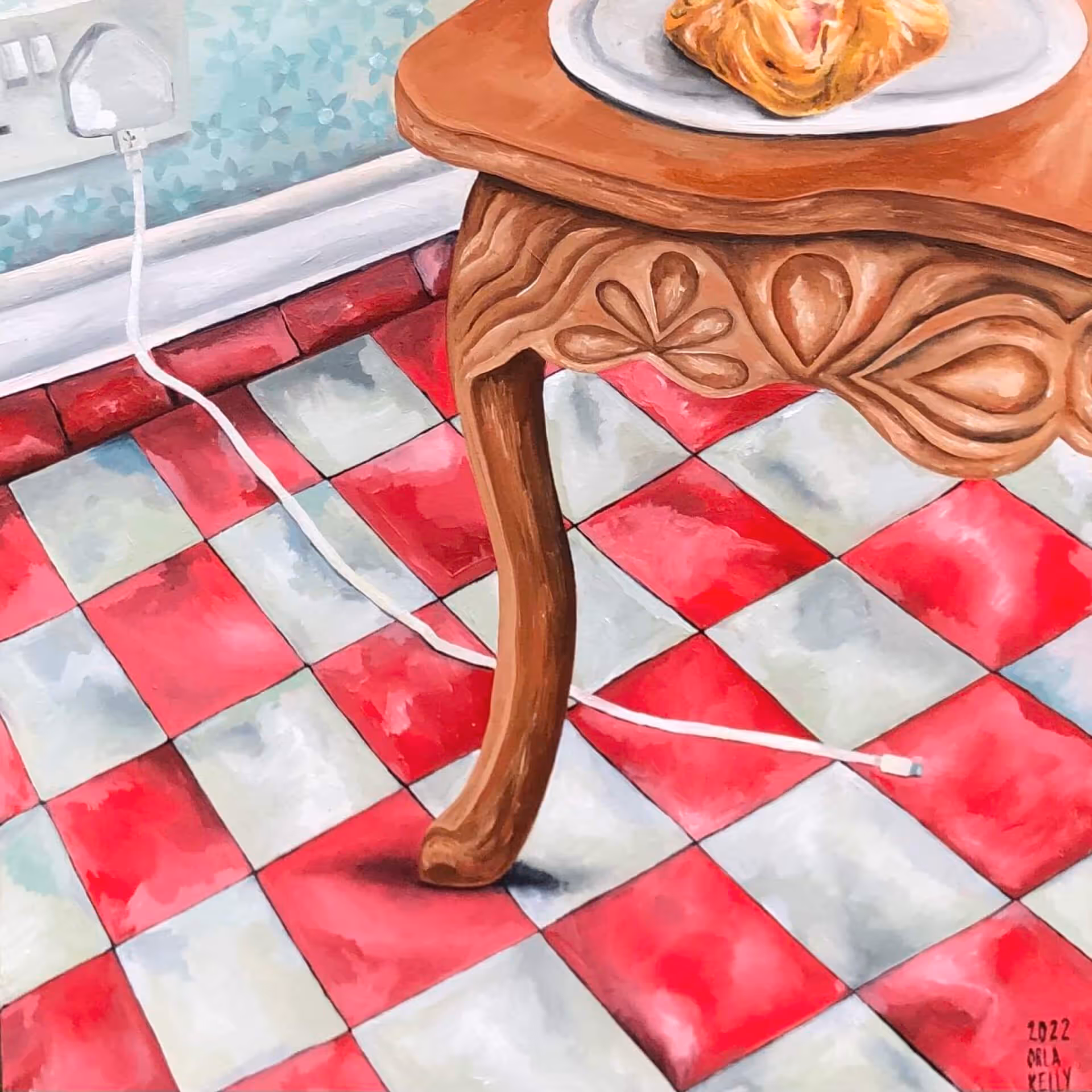
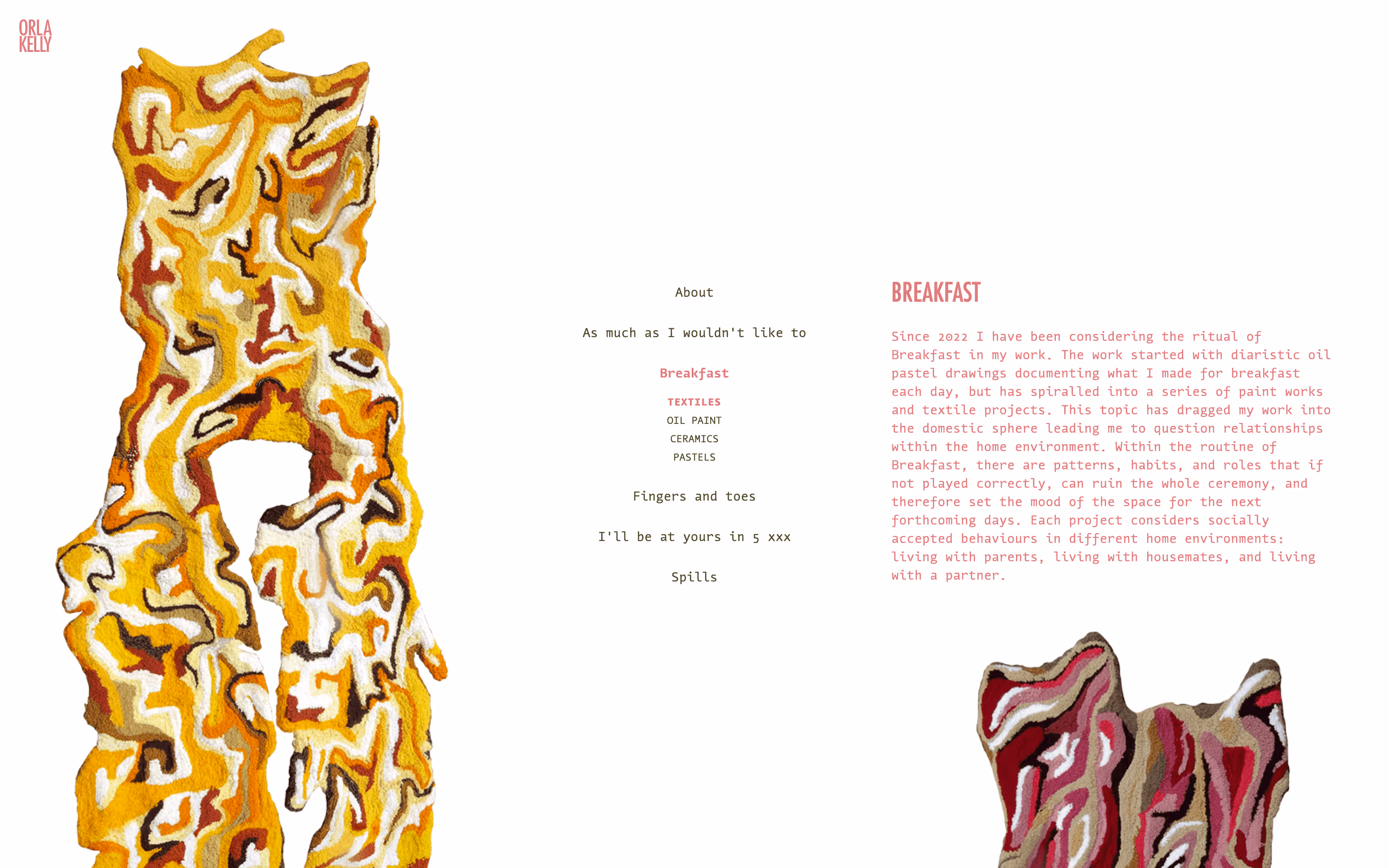
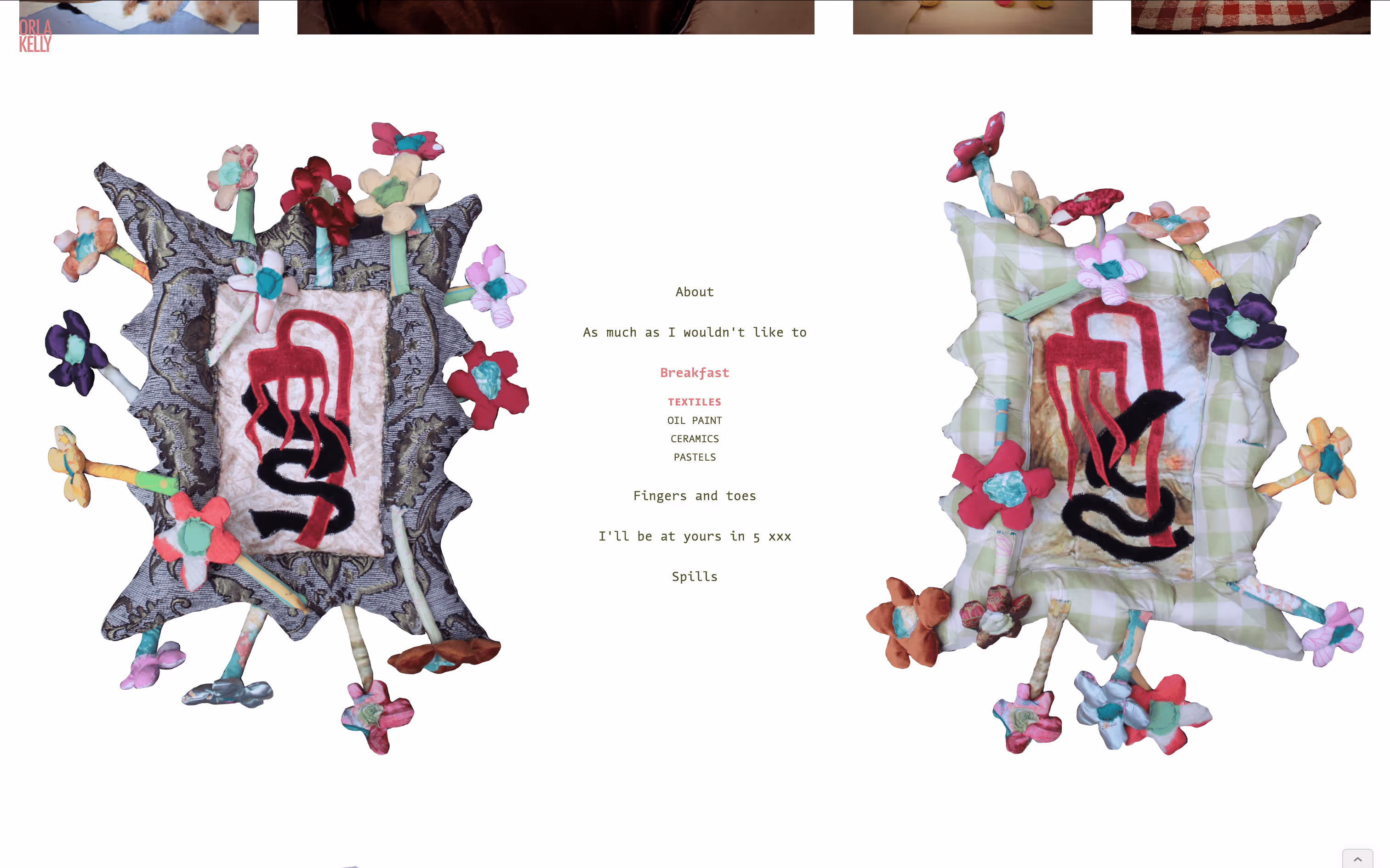
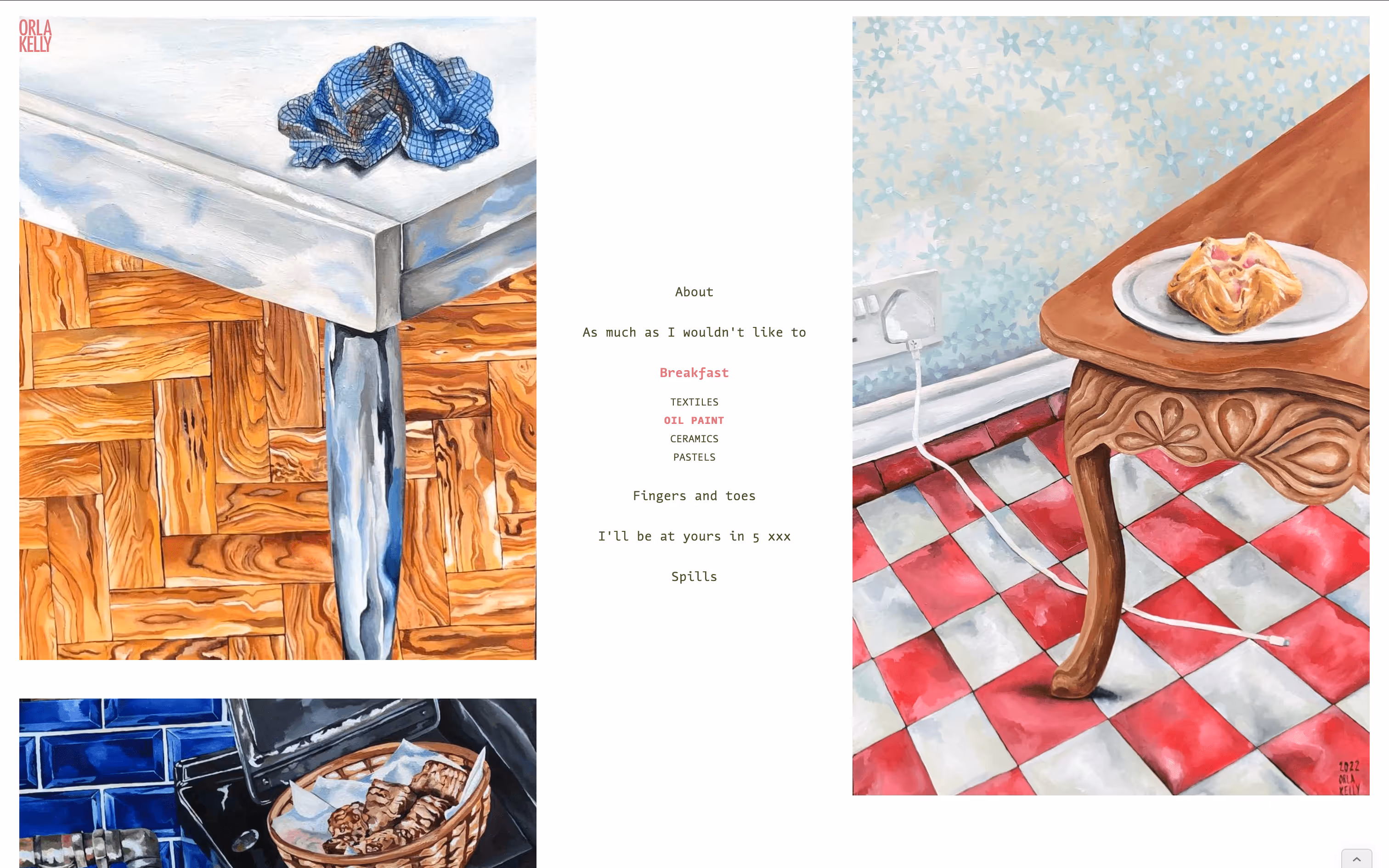
Wireframe of grid layout.
Wireframe of grid layout. Wireframe of navigation in centre of page.

Gallery "Entrance"

Each gallery opens with a project statement, as you would expect at the entrance of a physical exhibition. I also had a lot of fun playing with the space, balancing the text with a key piece from the series.

Screenshot of homepage.
Homepage
Screenshot of hero section of "As Much as I wouldn't want to" page.
Hero section of As much as I wouldn’t like to
Screenshot of hero section of "Breakfast" page.
Hero section of Breakfast
Screenshot of hero section of "Fingers and Toes" page.
Hero section of Fingers and Toes
Screenshot of hero section of "I'll be at yours in 5" page.
Hero section of I'll be at Yours in 5
Screenshot of hero section of "Spills" page.
Hero section of Spills

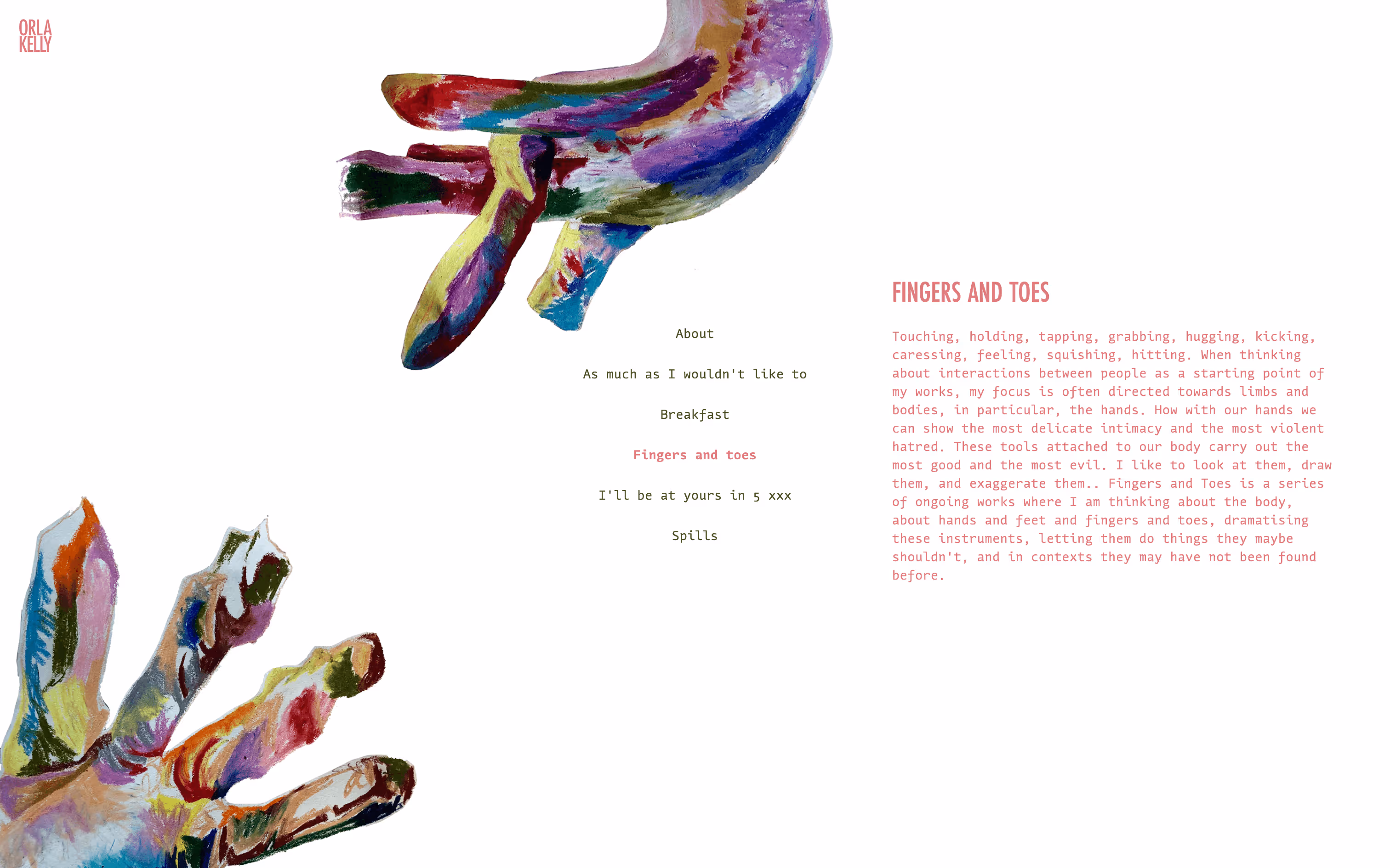
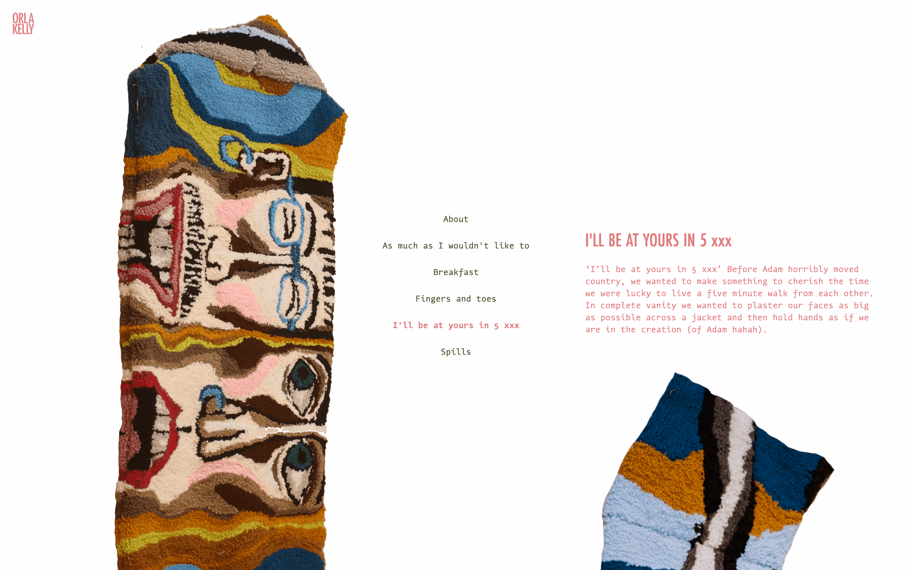
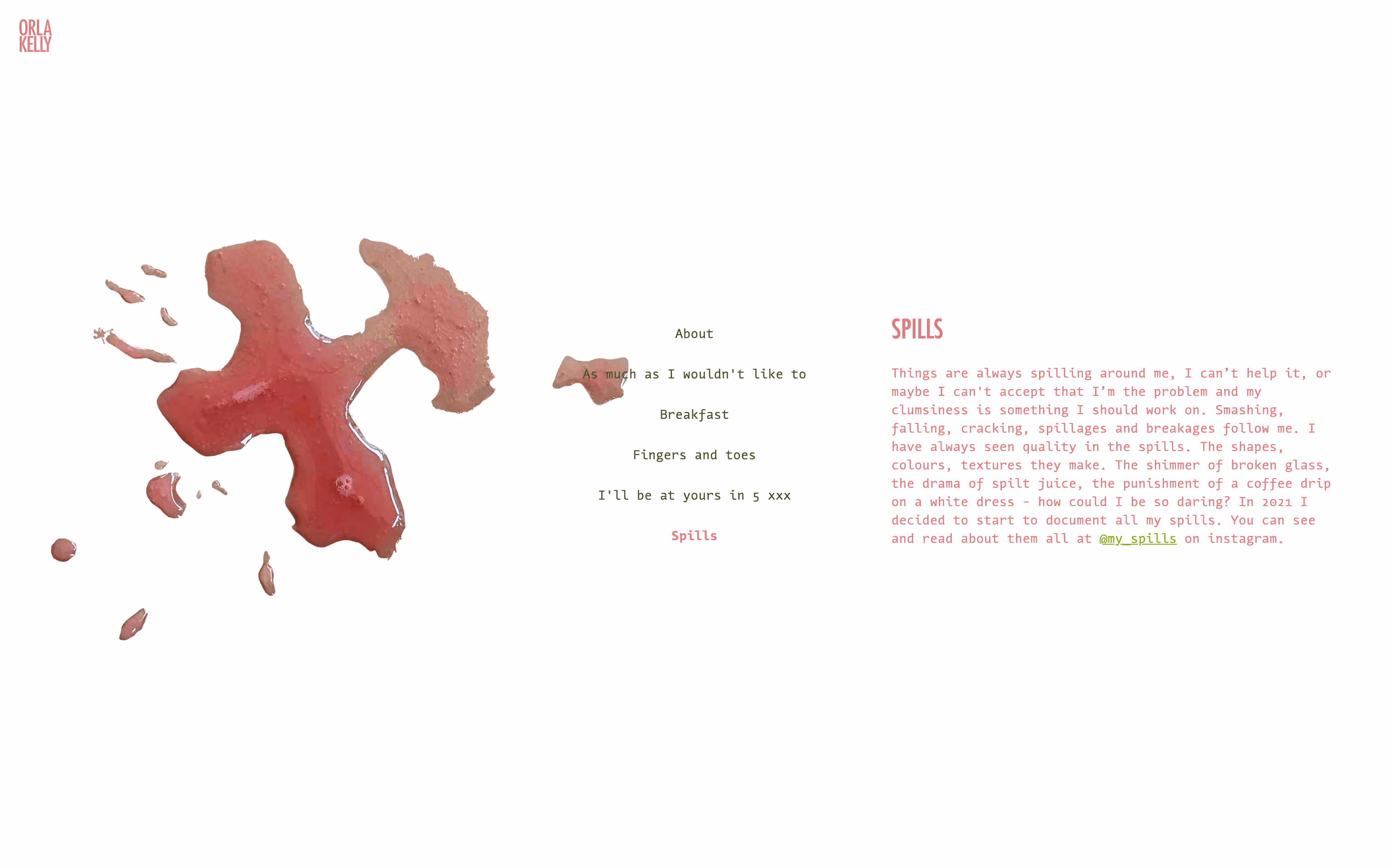
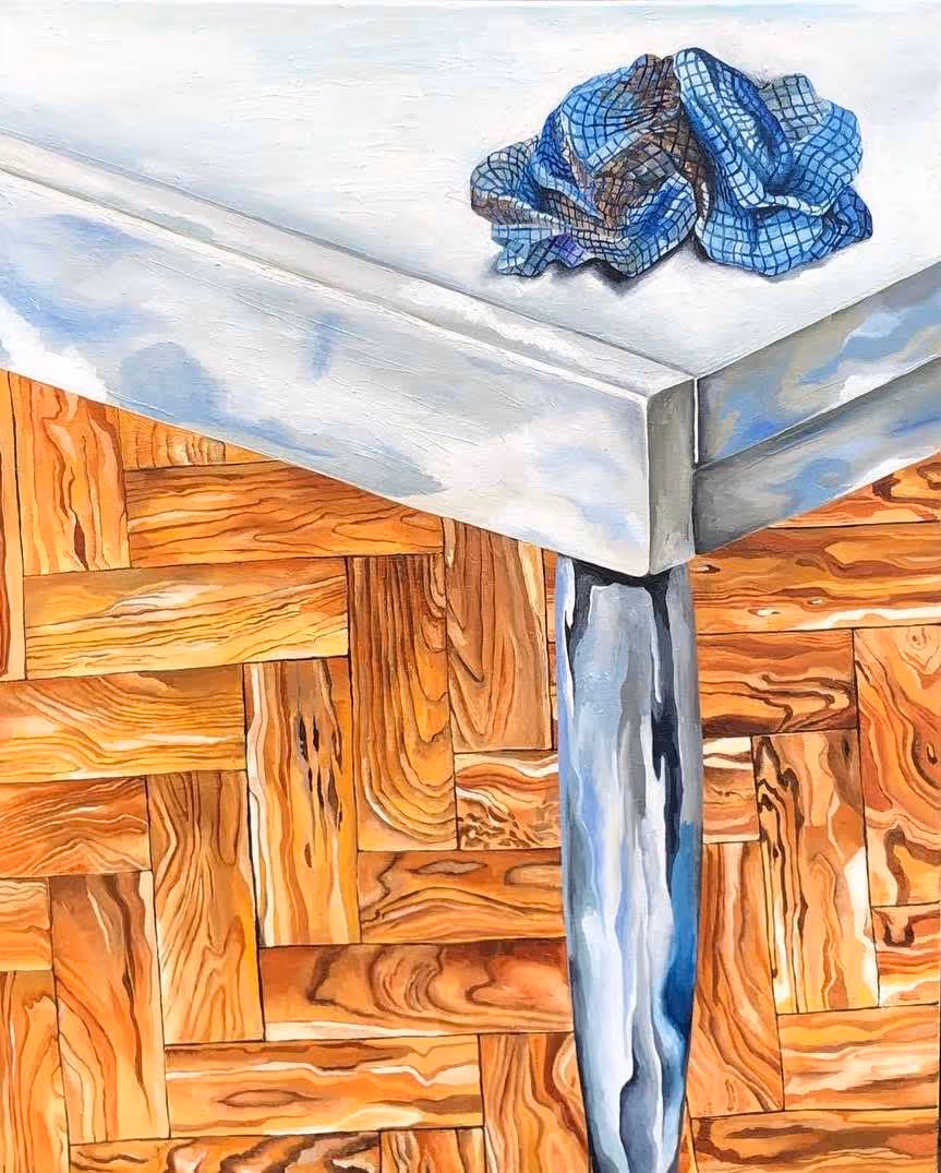
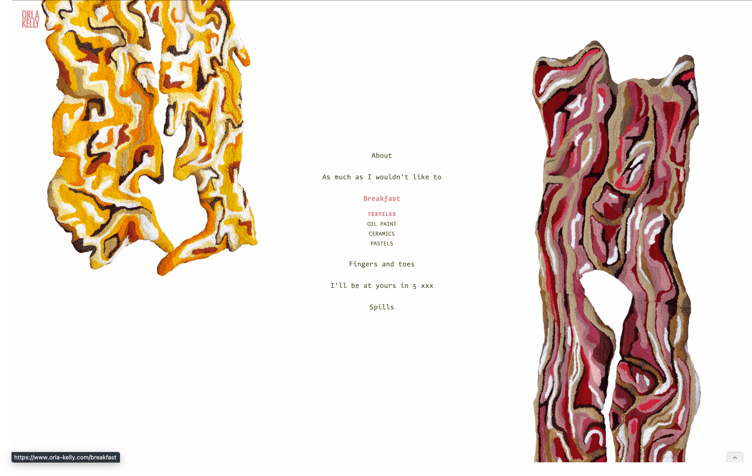
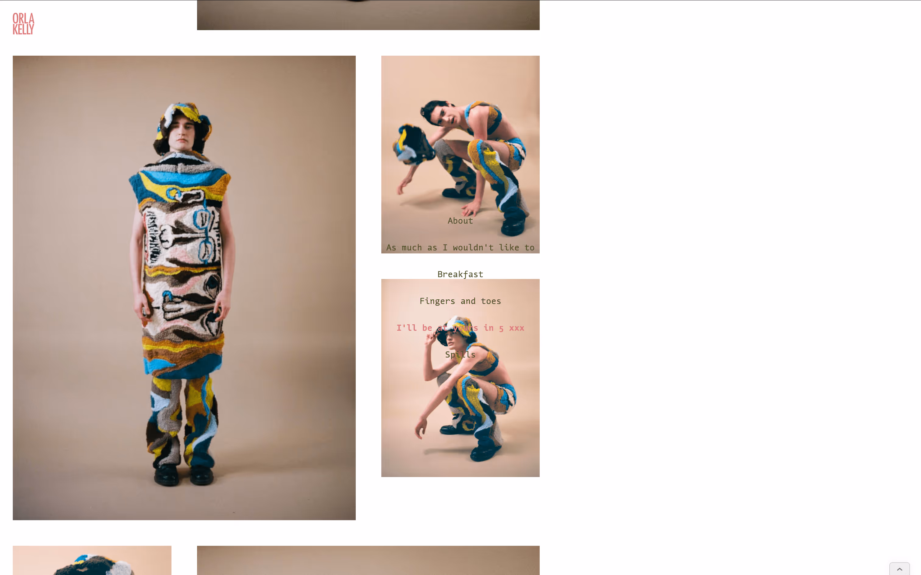
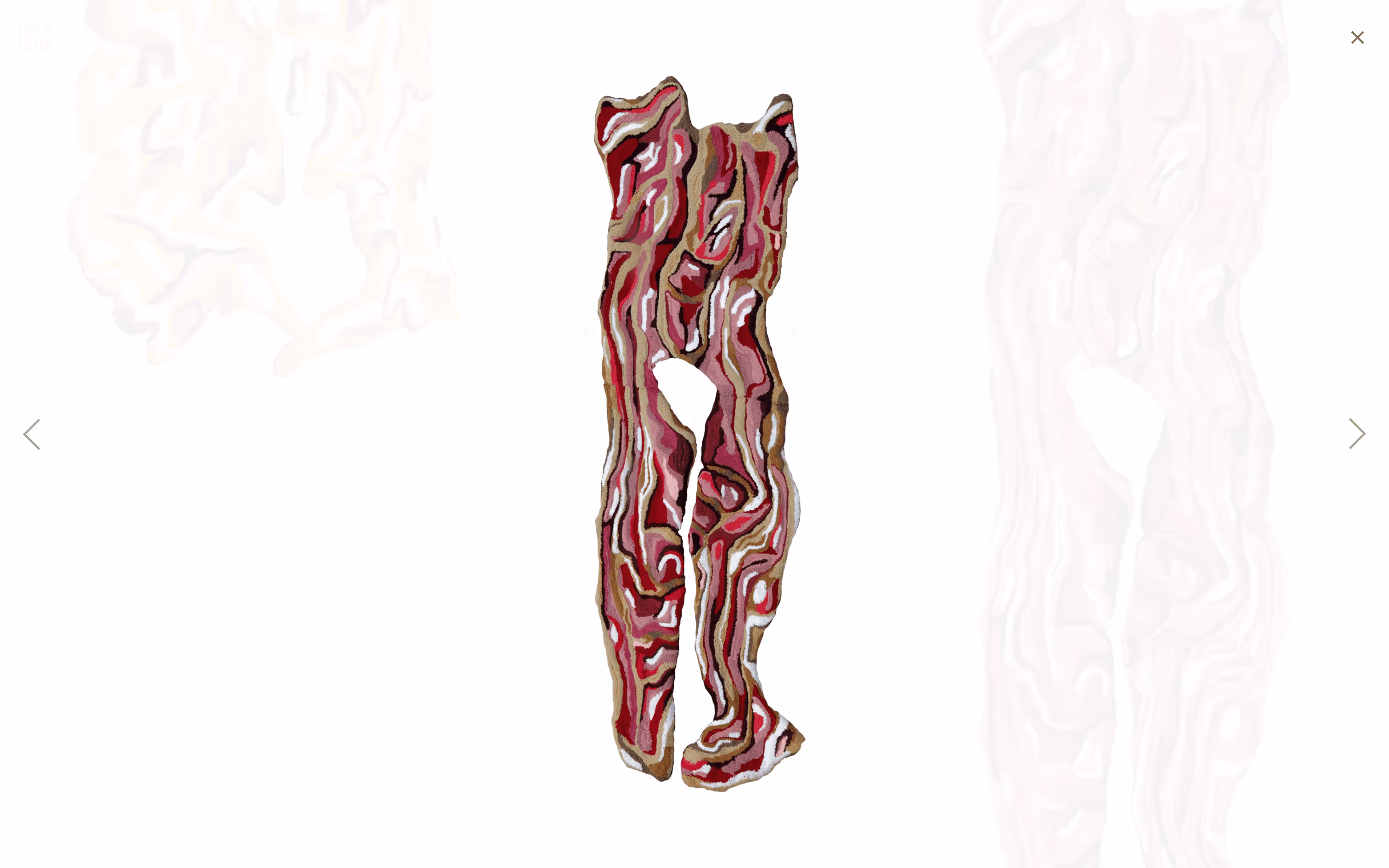
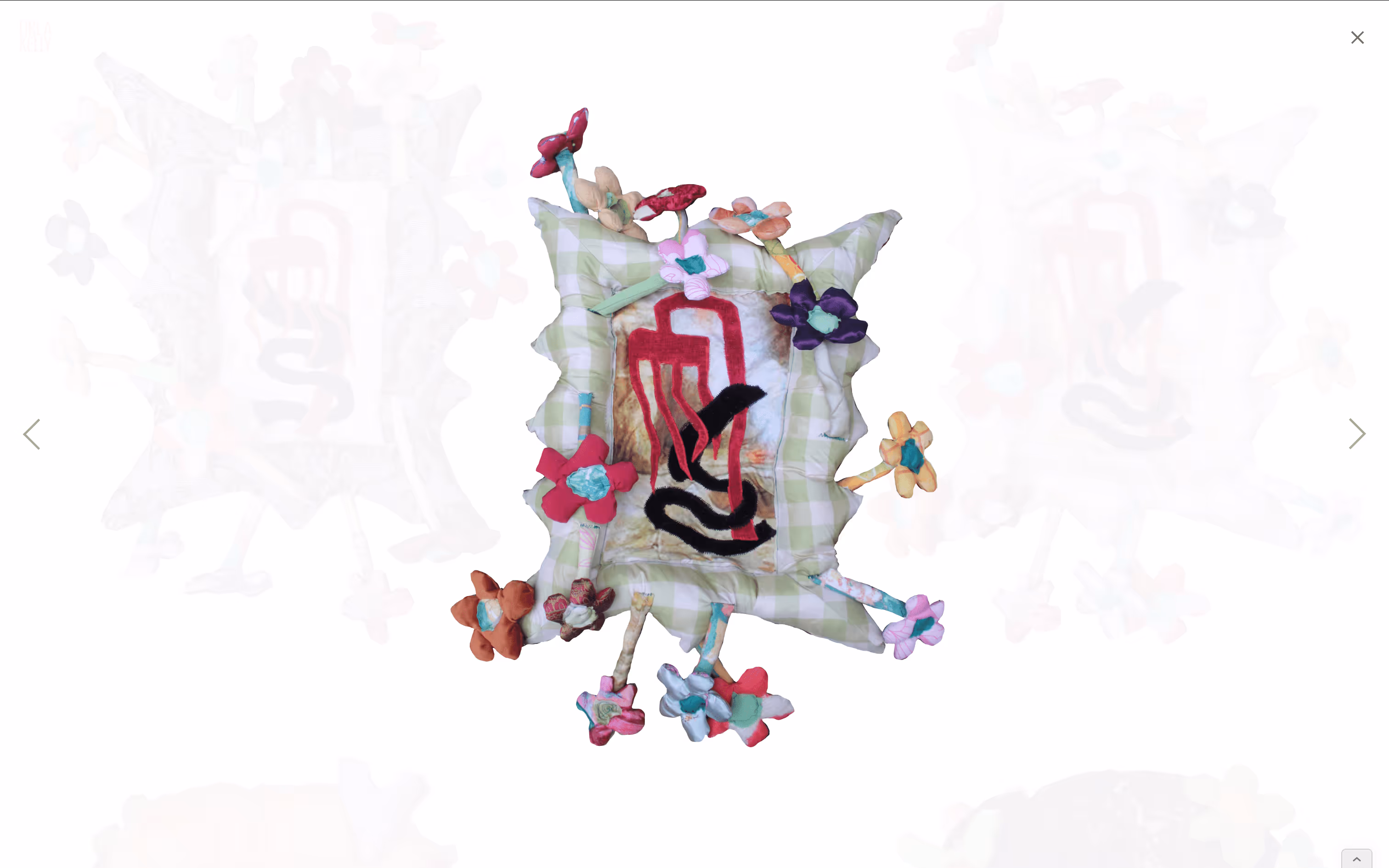
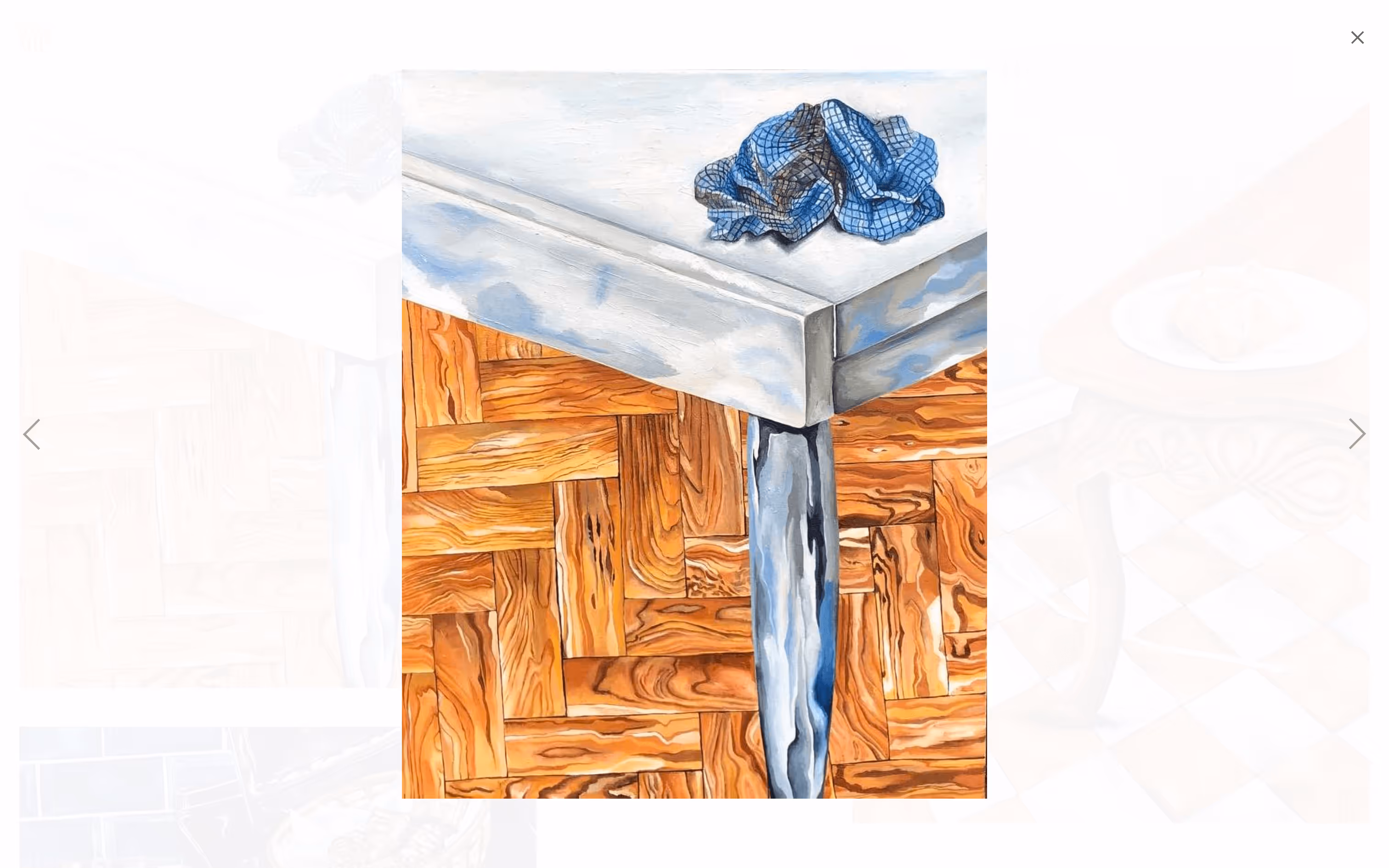
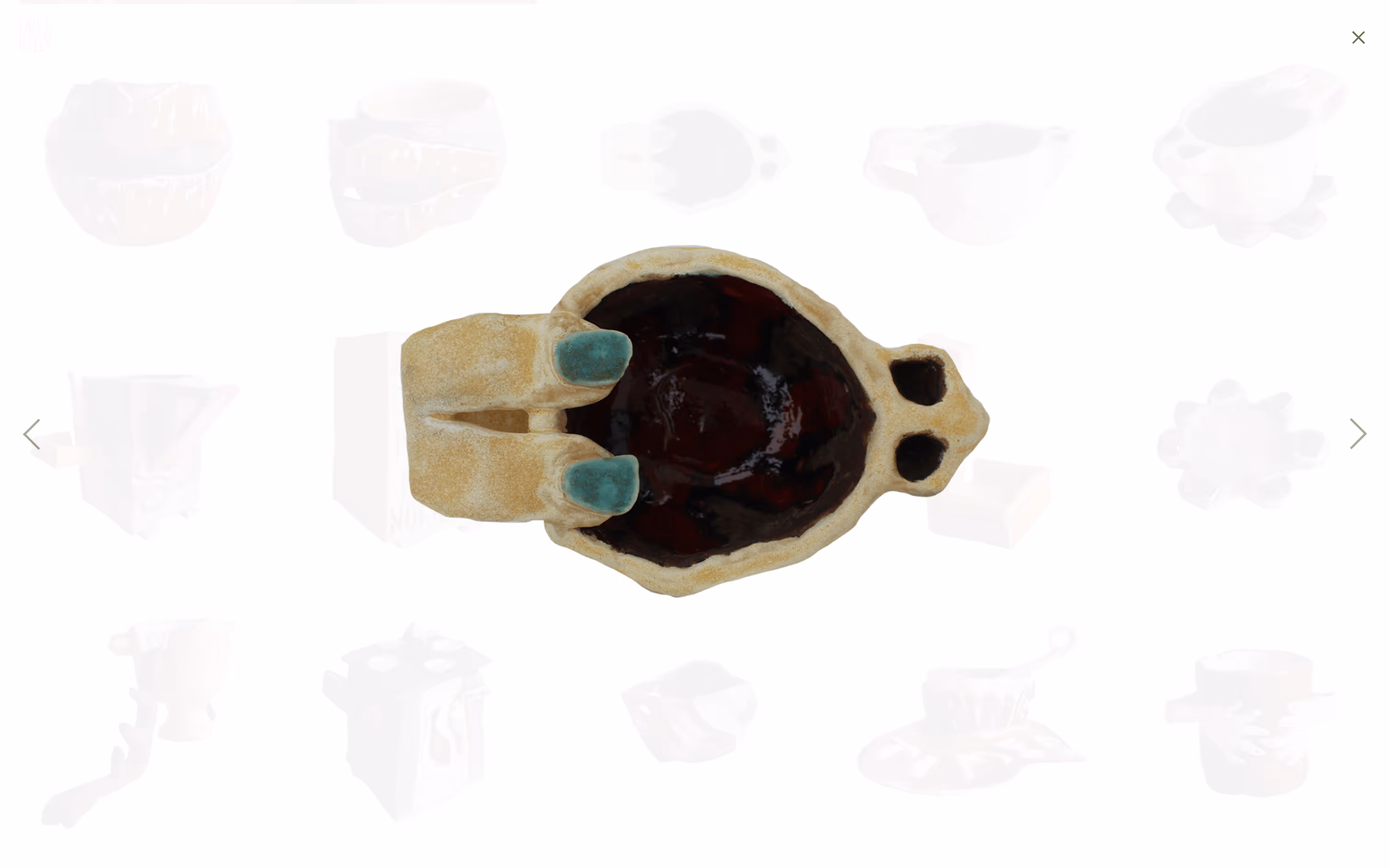
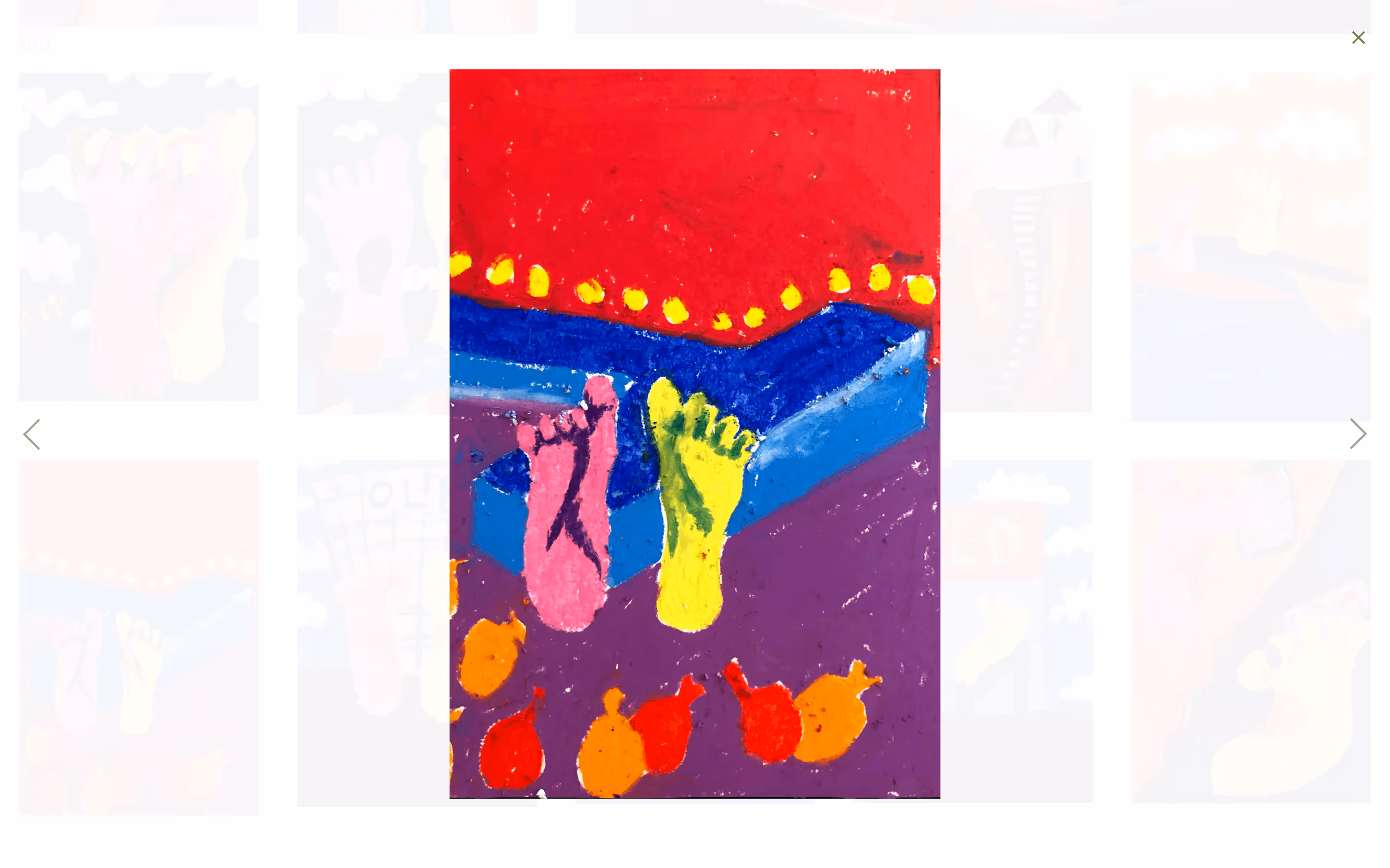
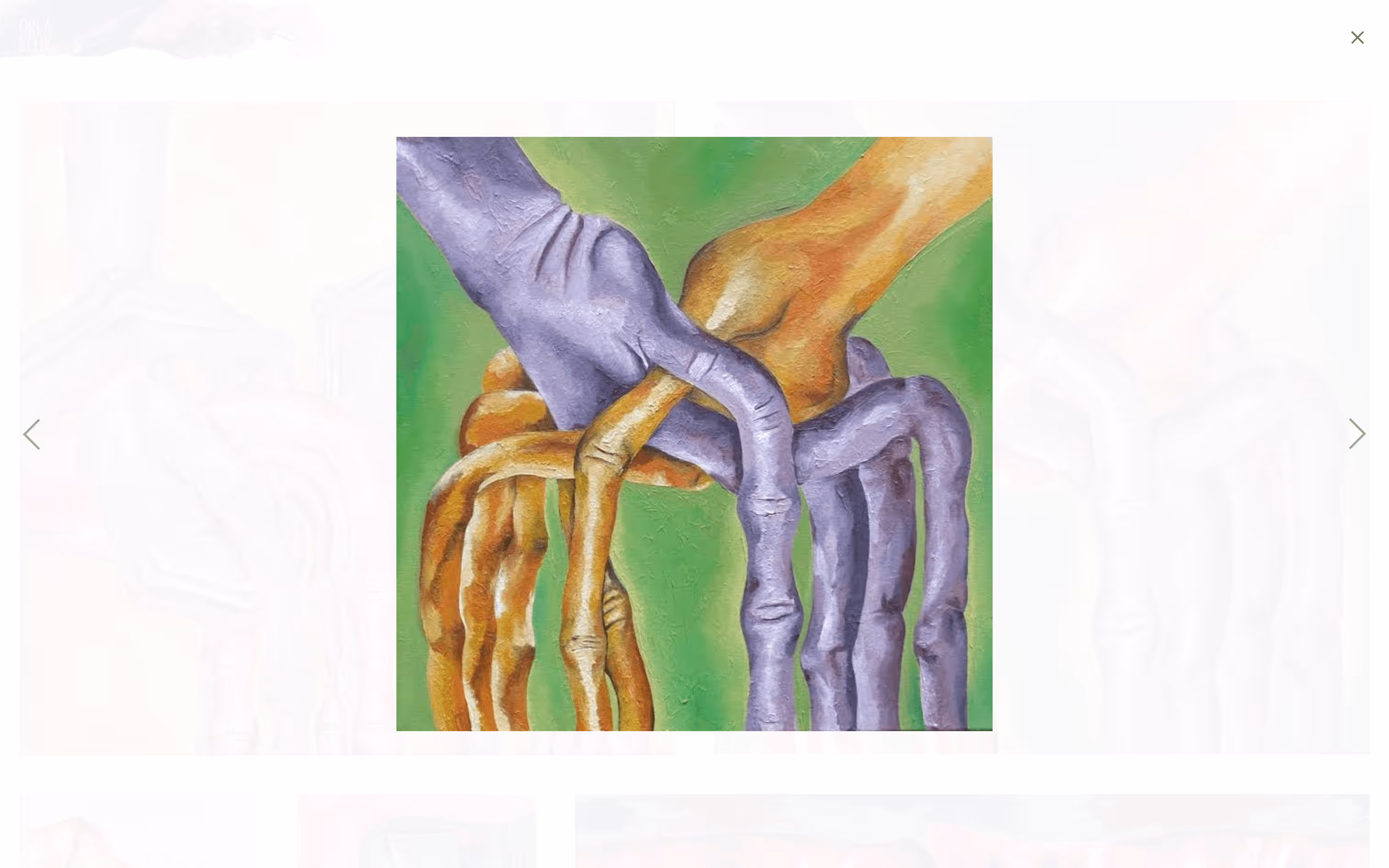
Isolated view vs Gallery view

I love the results of laying out Orla’s work in grids and compositions, the side-by-side visuals are beautiful. But it was just as important to give each piece its own space, allowing for a more intimate, isolated view.

Screenshot from site showing  paintings from "As much as I wouldn't want to" series.
Screenshot from site showing  oil drawings from "As much as I wouldn't want to" series.
Screenshot from site showing  paintings from "As much as I wouldn't want to" series.
Screenshot from site showing  textiles from "Breakfast" series.
Screenshot from site showing  paintings from "Breakfast" series.
Screenshot from site showing  ceramics from "Breakfast" series.
Screenshot from site showing  paintings from "Fingers and toes" series.
Photos of model wearing textile sculptures from "I'll be at yours in 5" series.
Gallery view samples
Screenshot from site of isolated view of photo of textile from "As much as I wouldn't want to" series.
Screenshot from site of isolated view of oil drawing from "As much as I wouldn't want to" series.
Screenshot from site of isolated view of textile from "Breakfast" series.
Screenshot from site showing isolated view of textile work.
Screenshot from site of isolated view of painting from "Breakfast" series.
Screenshot from site of isolated view of ceramic from "Breakfast" series.
Screenshot from site of isolated view of painting from "Fingers and toes" series.
Photo of model wearing textile sculptures from "I'll be at yours in 5" series.
Isolated view samples

Webflow development

This was the 2nd significant project I built on Webflow. At the time, I was excited by how far I'd come from the 1st project. Looking back, I’ve no idea how I survived without a proper framework. Still, this project pushed my frontend knowledge and Webflow skills forward in a big way.

A recording while updating the site with some new assets and features.

Results

I feel like this is the part where I should list all the amazing opportunities that have come Orla’s way since launching—but that feels a bit gross. More important to me was the experience of working with my sister. It was great fun, and I got a taste of what it’s like to collaborate with her on something. Fingers crossed we’ll get to do it again soon.

Photo of site designer, Ciarán, and site owner, Orla.
Me and Orla

More Projects

Black and white diagonal stripe pattern repeating the word 'IZIZI' across the thumbnail.
IZIZI
Large white letters spelling 'FAILURES' diagonally across a black background.
Collecting Failures
Close‑up photograph of a black cow's head focusing on its eye and ear.
317