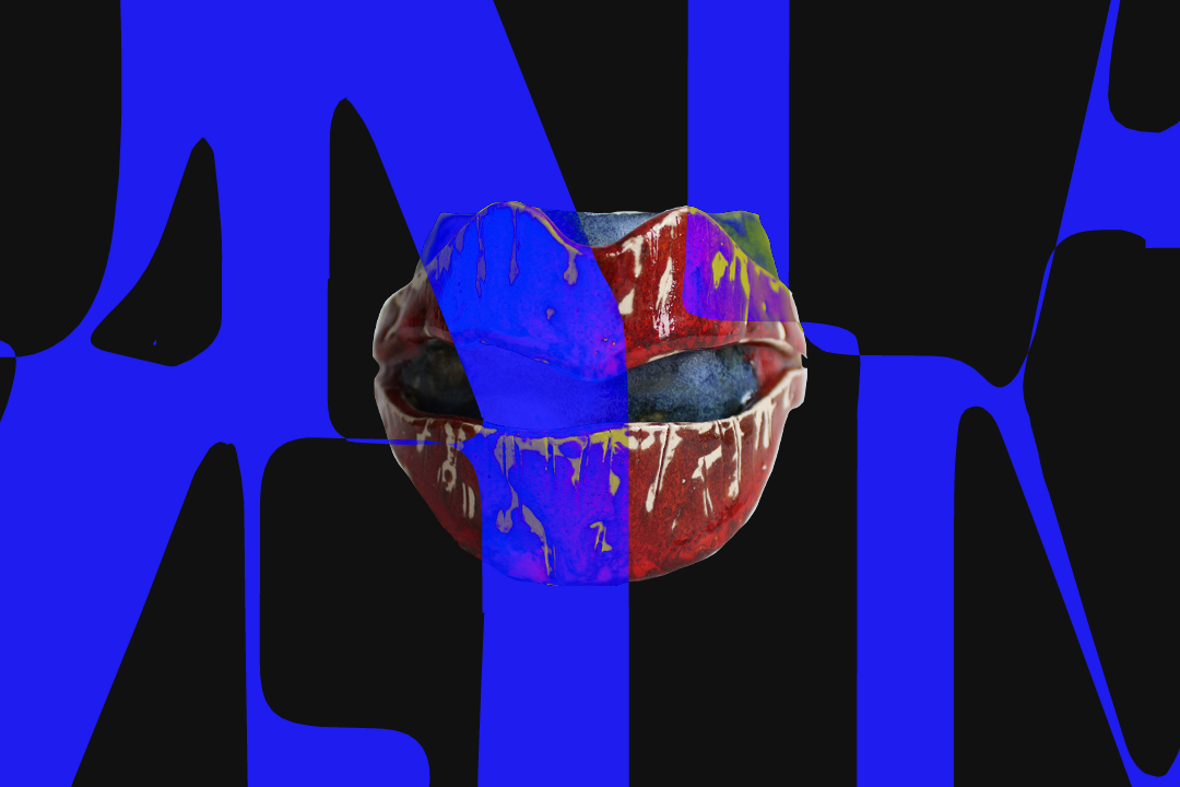
This page uses the styles that were initially going to define the entire portfolio. It was a complete rabbit-hole, it cost me months of progress, but I think you’ll recognise I had a lot of fun exploring this direction. It deserves a place here.
My Own Brief
- I spent years living abroad, having to over-explain my name, Ciarán. I wanted something easier to work with for my professional work. Something simpler, less awkward, and maybe more memorable. Something that didn’t need a phonetic breakdown every time I introduced myself.
- I knew this portfolio would be built in late evenings & weekends. In order to stay focused, and not be distracted by a more exciting graphic or motion experiments, I needed something playful. I wanted something that would let me mess around with visuals and enjoy the process.
Hello “IZIZI”
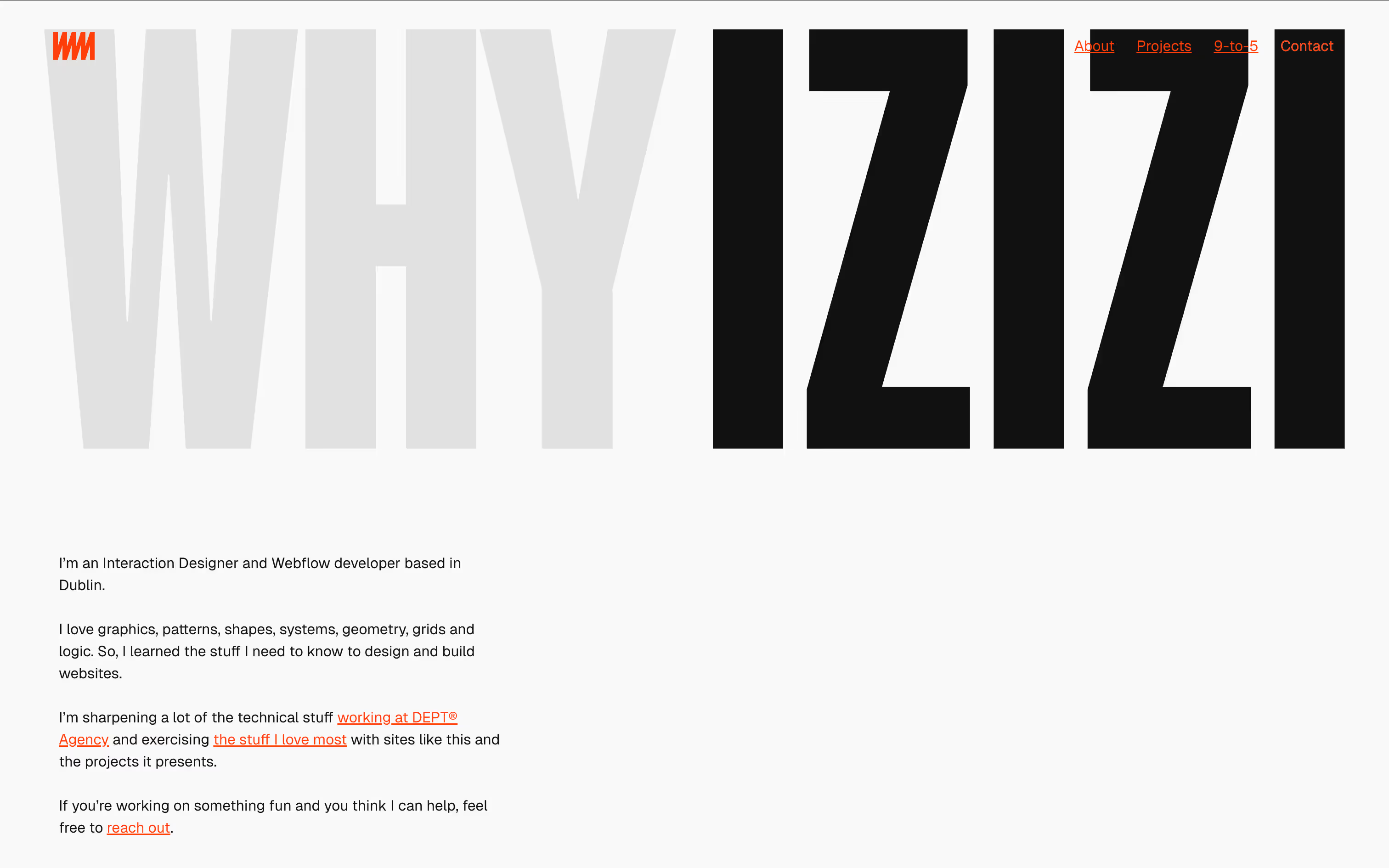
I was playing with letter shapes one day (as you do...) and I stumbled on a tidy little ambigram; IZIZI. A word with a beautiful shape, and pronounced similarly to “it’s easy” (in my head at least), which gives it even more milage to play with. It was never really intended to be a brand. It was just a word I could hang a bunch of experiments off. And for a while, that was exactly what I wanted.


IZIZI logo
When I first picked up the word “IZIZI” to play with, I just happened to used a condensed typeface which I love, Italian Plate Condensed No.2. That was it, it stuck.
A Graphic Playground
There is so much to play with in the shape of the word IZIZI. The typeface, Italian Plate Condensed 2, was also big, bold and great fun...
Too Loud?
I love that bold graphic style with blown up type, high-contrast black and white with punctuations of an accent. I also find it an enjoyable space to design in, but in the end I chose to go with something a little quieter. Here are some samples of the page headers on the site before I changed course.
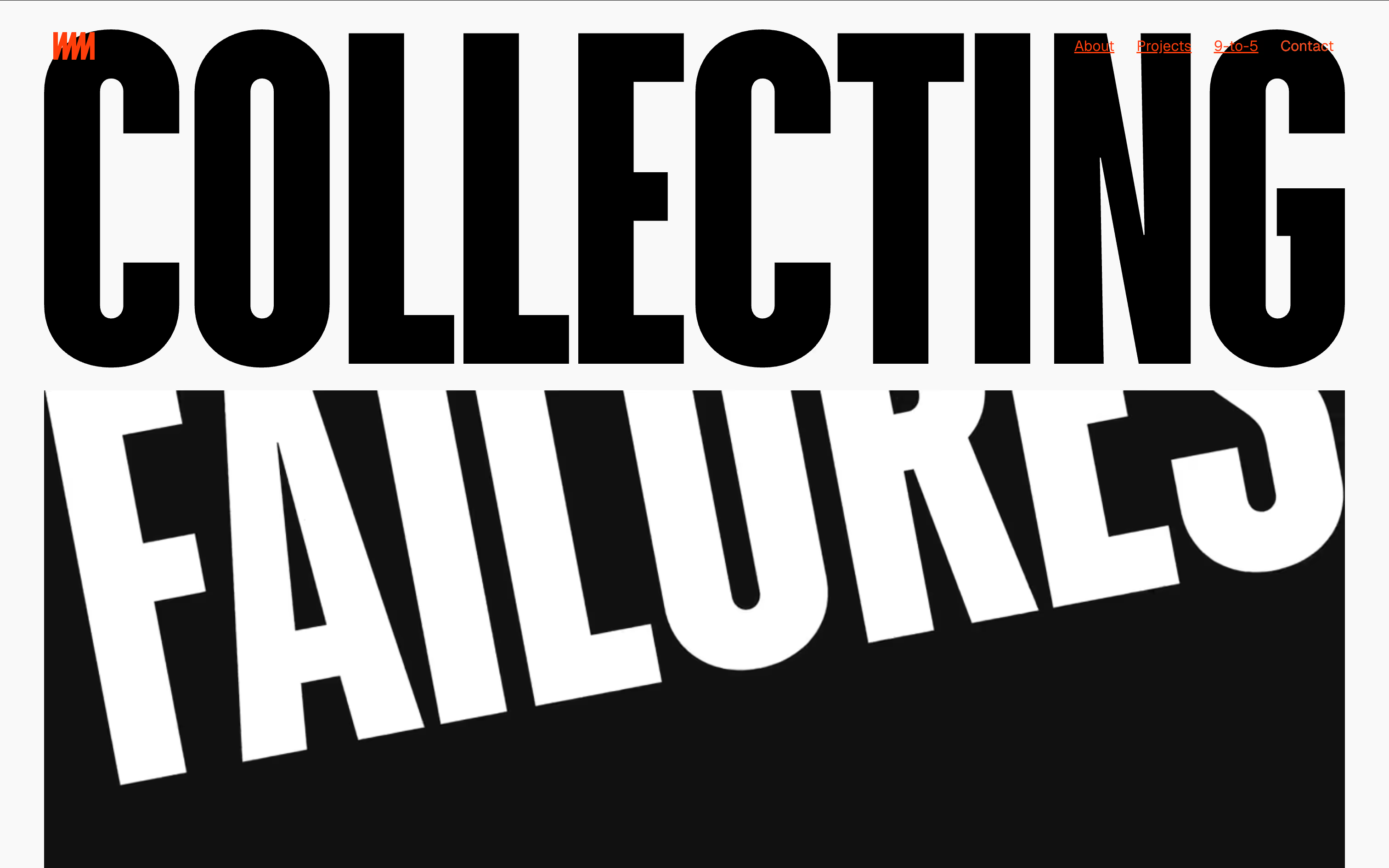
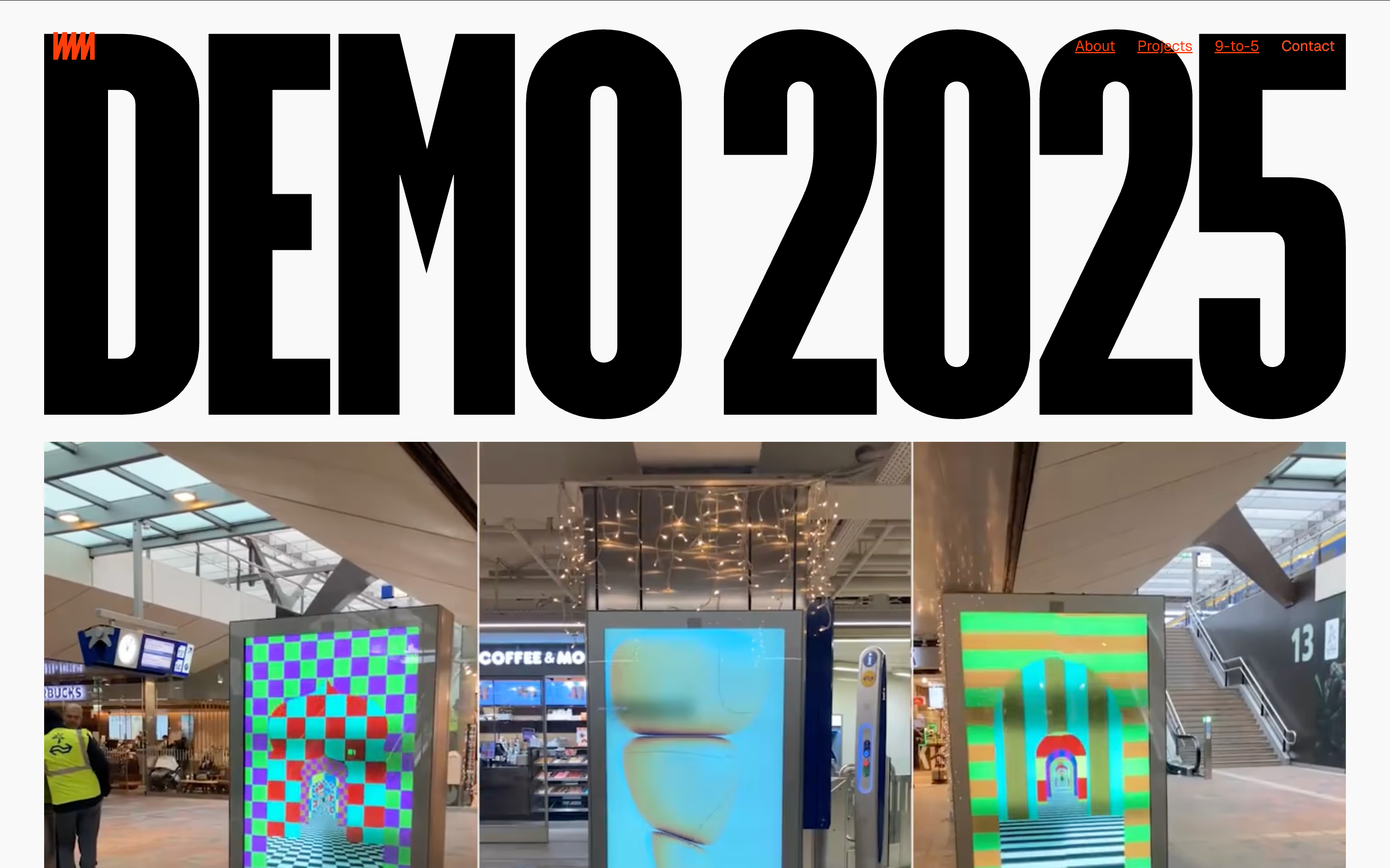
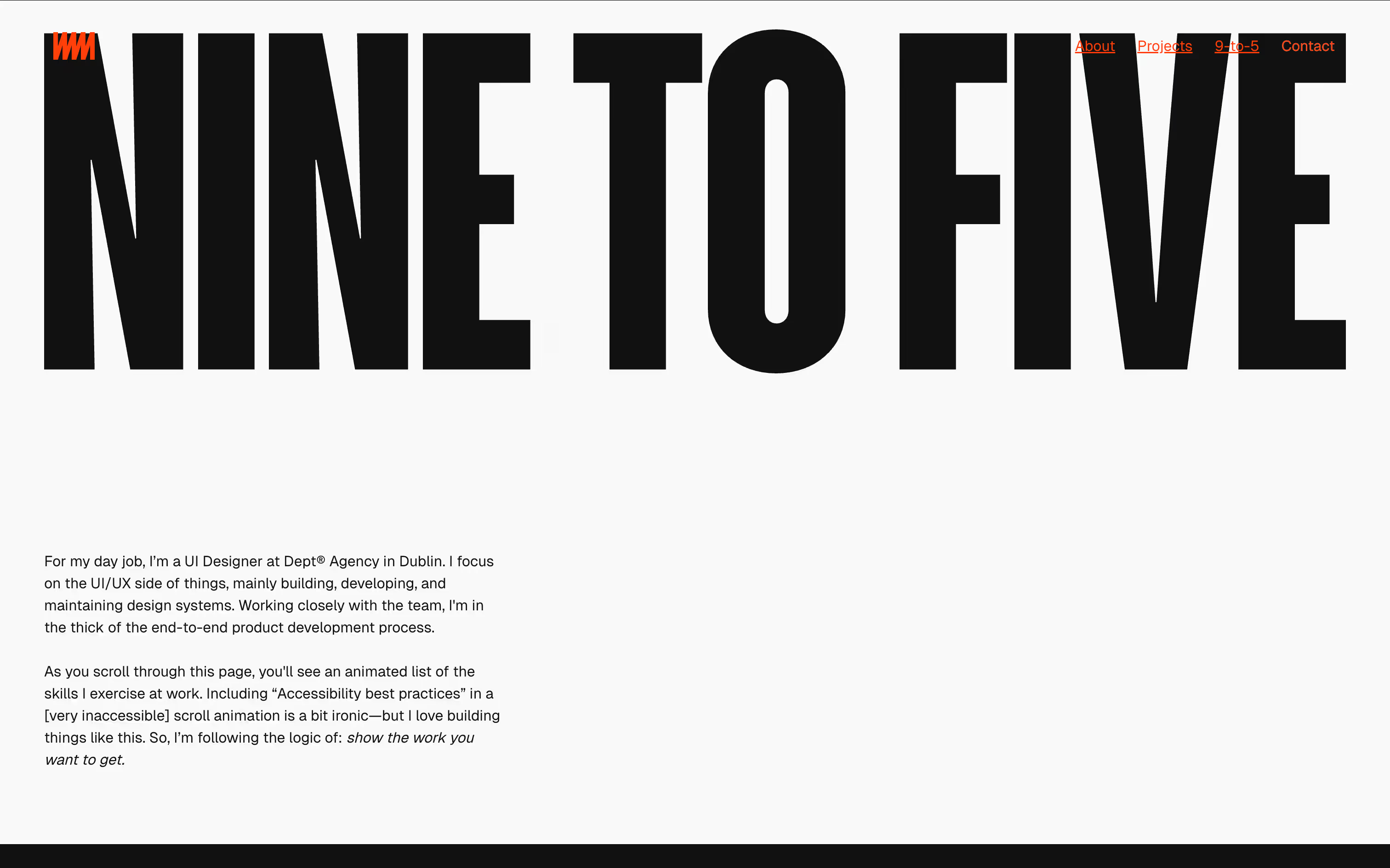
Goodbye “izizi”
The IZIZI visual language never really made it out of the experimental phase, so the visuals never got the time or refinement they needed. Small optical imbalances started to really annoy me. The idea was fun but ultimately I realised it was driven more by excitement than intention. As you can see from the rest of the site, I went with something a bit quieter, but still really nice to work with.
