Orla Kelly Artist Portfolio v02
Redesign and build an artist portfolio site to be content-manageable, flexible, and easy to maintain.
Site Architecture and Navigation
We both loved the deliberately awkward placement of the navigation in the centre of the screen on all pages of the previous site. Besides a simple homepage and one page of info about Orla and her practice, the rest were projects or case studies.
This time around, we collapsed the list of projects into a navbar, and let the about info live in there too. I’m not really worried about SEO or analytics here because most visitors arrive via direct links shared by Orla, already intending to view her work.
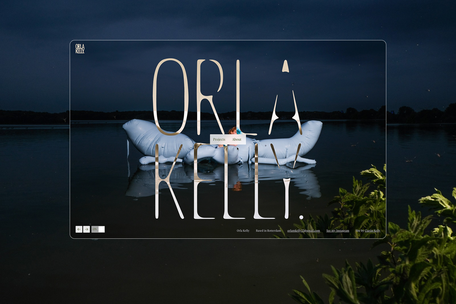
In a kind of homage to the old site, we put the nav in the middle of the screen on the homepage, but out of the way of the other content on the content pages.
Homepage Interaction and Play
In the previous site, I fell short on a promise to Orla to incorporate a quirk that makes the site feel more suited to the Artist portfolio context. I took the homepage as an opportunity to correct that this time around.
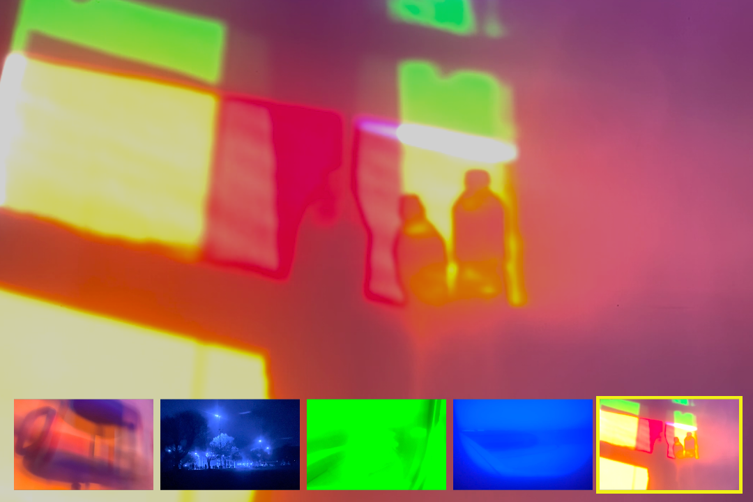
I spent a couple of days playing with SVG filters and GSAP morph animations, trying to achieve an idea I had for a kind of bleeding effect on Orla’s logo (let’s call it that). In that discovery, I stumbled upon this very chaotic morph effect that I loved and followed in a whole new direction.

The organic forms of the logo morphing between states echo the qualities of Orla’s practice, so I let them interact by placing the morphing SVGs over a looping gallery of her work. Orla can keep things fresh with new works as she has control of the image selection in the CMS.
The scale is driven by the proximity from the navigation in the centre of the screen to encourage visitors to trigger more dramatic visuals.
GSAP provides fine tuning control of SVG morph interaction, Swiper JS controls the background images, and in the end we’re both really happy with the result.
Technical Foundations & Build
It made more sense to start the site from scratch using the Lumos (a very clever Webflow development framework by Timothy Ricks) than to pick up the previous site.
I haven’t gone mad on the interactions and GSAP animations in this project, but where I did use GSAP for the navigation and homepage I didn’t use Webflow’s native GSAP controls. Given the nature of the interactions, it was easier to write the code with ChatGPT and connect the site to a GitHub repo.


CMS
While I’m happy with the update to the design, that’s not where the time went in this project. The real focus was on empowering Orla to add content and pages as she needed to.
The foundations set by the Lumos framework (mentioned above) stretch far beyond variables and utility classes. The pre-made set of open and closed components made it easy for me to create a set of responsive, modular page-sections that Orla could easily use to build out the pages with variety and creative expression.
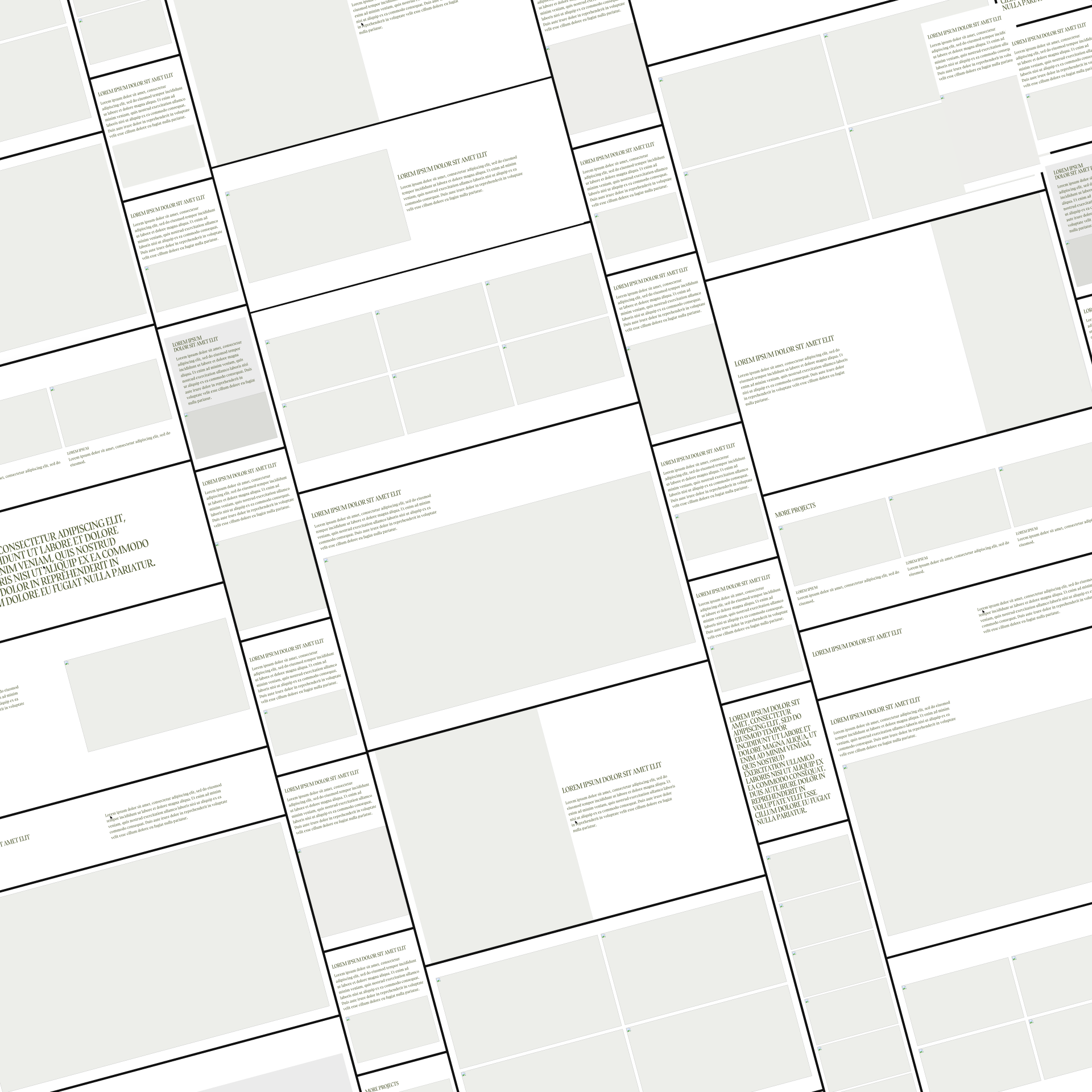
Bento-grid
Keeping the bento-grid layout used throughout the previous site was an interesting problem to solve in a way that Orla had control. The solution uses component variants to offer complete control. Orla can select the “size” of each grid item from a list. Placeholder components with the same properties offer whitespace controls. There’s a mental model Orla needed to adopt but, after a couple of hours onboarding, she had a firm grip on the use of the entire CMS, including the bento-grid solution.
Reflections and Blurring Lines
I’m happy I can create decent designs on the fly, so the systems, structure and designs came naturally. That said, I know that if there was time for the visual research and discovery we could have landed on some really interesting visual results. In this project, however, development took up most of the time and offered the greatest lessons.
I’m increasingly drawn to the capabilities of code. I can’t sit down and write JavaScript from scratch, but tools like ChatGPT have meaningfully changed how I work. They’ve made it possible to explore ideas, test approaches, and understand what’s happening under the hood.
I love working with Webflow, I enjoy building systems, and I’m much more comfortable spending time in code than I would have been even a year ago.
The shape of tools and technology now makes me wonder about what role I play in this world of web development.