Melissa O'Donnell Artist Site
Redesign and build an artist portfolio site for Melissa O'Donnell.

UX & IA
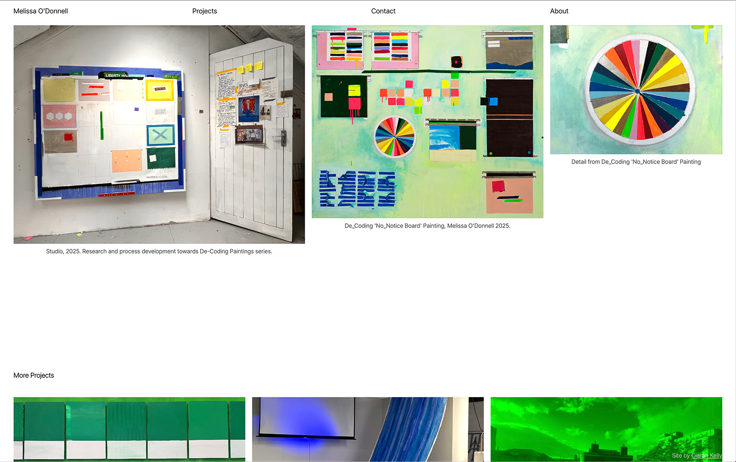
Simply organising Melissa’s work by project, each with its own page, was a big structural improvement on her previous site which had grown organically without a framework in mind.
All designs are responsive, I’m going to focus on desktop for the rest of this page, but feel free to check it out on mobile too.
- Homepage (nav item): Routing page to content across the site
- Projects listing page (nav item): Links to all projects
- A project page for each project.
- About modal (Modal, nav item): Artist bio, exhibitions, education, press
- Artist research and practice: Deeper dive into Melissa’s experiments, workflows and processes.
- Contact form (Modal, nav item)

Look & Feel
We went with a clean, minimal editorial aesthetic. The openness suited this project to give Melissa’s artwork the breathing space to evoke feeling and give a sense of her practice.


Some decisions around type
Inter tight: Open source. Clean, modern, workhorse. The homepage layout really only needed one typeface, same weight, same size, etc. Then I tried to stretch that as far as I could, using layout and context to communicate content hierarchy. I deviated in a couple of cases, but succeeded for the most part. That was fun, and results feel calm and spacious, but with an intentional tension.
Accent Yellow
Or accident yellow. I used a yellow occasionally, mostly through interactivity on the homepage. I was using it as a placeholder or something I think, and I liked the look of it, Melissa did too, and again, we just rolled with it and it felt good.
Homepage
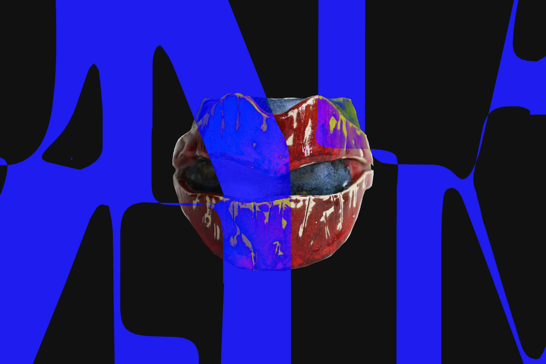
The first time I saw any of Melissa’s work was going through her old site. I loved the videos from her Insider / Outsider project. The imagery has a soft, diffused quality that I thought would be perfect for overlaying text on, almost like gradients in motion. Without saying anything in particular, the imagery manages to say a lot. I mocked up an idea, presented it to Melissa, she loved it, and we went with it. She suggested including a short series of other videos with suitable background qualities, which we did, and it works really well. I love how the little thumbnail controls contribute to the overall homepage composition.
The other feature worth mentioning on the homepage is the full screen feature image per project with a dramatic, slow zoom-out when hovering on a project list item.
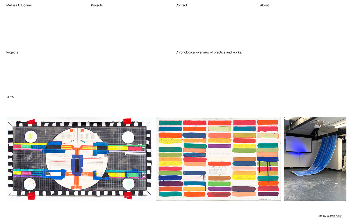
Projects Listing Page
As the title suggests, a page listing projects. We wanted an indication of the chronology of projects and landed on a lovely simple solution. A horizontal scroll through projects mapped on a timeline with the sticky year-tag as a nice touch.
Project Pages and CMS
We leveraged Webflow as an excellent tool to empower content editors and marketers to build and edit pages, and Lumos as an excellent framework to build fast. I’ve written in more detail on this for the project for Orla, so I won’t dwell here.
Technical Stack
Webflow primarily. Figma for design. Claude was super valuable for some of the custom code (consider the scroll on desktop the projects listing for example). Connecting Claude to Webflow’s MCP. Little bit of GSAP. Little bit of Lottie.


Looking Back
To be honest, the discovery phase was pretty informal. There was no extensive mood boarding or five-round design iteration. It’s not necessarily best practice, but we had a nice flow going. I followed what felt good, showed Melissa, if she liked it, we moved forward, if something was missing, we introduced it. It wasn’t the "textbook process”, but it was such a pleasure. Like I said, it flowed. Thank you, Melissa, for that. She was open to ideas and trusted decisions and the direction. That kind of client relationship moves things along faster than any process. I was lucky.
Given the chance, I’d love to spend more time on the interactions and animations. The site is clean and it does a good job, but there's more fun to be had in that space; scroll-based animations, smoother transitions, more considered micro-interactions. Scope and time being what they are, those will have to wait. Maybe a v2.
For now, we’re really happy with it. It represents Melissa's work and process, it works on every device, and she can manage it herself. That feels like a big win.